Does this work for you?
#set page(height: auto, width: 20em, margin: 1em, background: context grid(
  // Draw 9pt stripes for reference
  columns: (1fr,),
  align: top,
  rows: (page.margin,) + (9pt, par.spacing) * 10,
  fill: (x, y) => if calc.odd(y) { teal.transparentize(75%) },
  ..([],) * 20
))


#let fit-content(max-width: 100%, max-height: 9pt, body) = layout(available => {
  let max-width = if type(max-width) == length {
    max-width
  } else {
    assert.eq(type(max-width), ratio)
    max-width * available.width
  }

  let (width, height) = measure(body)
  let factor = 100% * calc.min(max-width / width, max-height / height)

  scale(factor, reflow: true, body)
})


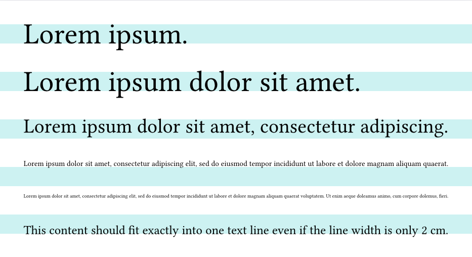
#for n in (2, 5, 7, 20, 30) {
  fit-content(max-width: 100%, max-height: 9pt, lorem(n))
}
#fit-content(max-width: 100%, max-height: 9pt)[
  This content should fit exactly into one text line even if the line width is only 2 cm.
]
In that case, you can tell AI the error message. It’s a good chance that AI can fix it at last.