I very much appreciate your help with this.
I hope this will fit the bill? I’ve simplified it and swapped out the image for a simple rect. I’ve also put the icon before the text because this seems to make a significant and useful difference.
#let icon = {rect[]}

#let hd3(words) = {
  context {
  //are we less than halfway across the page?
    if here().position().x.abs < page.width * 50% {
  //if so, stick it in the left column and fiddle the exact position a bit
    place(left, icon)
    } else {
      //otherwise, use the right column and fiddle the exact position a bit
      place(right, icon)
    }
  }; [#words]
}

#page(columns: 2)[

#hd3[hello]
#hd3[hello]
\
- #hd3[hello]
\
- #hd3[hello]
- #hd3[hello]
\


#colbreak()
#hd3[hello]
#hd3[hello]
\
- #hd3[hello]
\
- #hd3[hello here is some text to be longer]
- #hd3[hello]
\
]
What I get now:
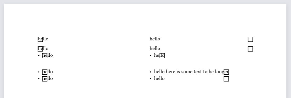
This is working better; the rects are now at least aligned vertically with the text.
My impression is that they are being placed at the boundary of the column, in the case of the paragraph text. For the bullet lists, a stretchable boundary seems to be created to fit the text within that list, and the rect gets assigned to the outermost position so far. I don’t know why these behave differently.
Possibly relevant: the spacing between the paragraphs with the icon is slightly larger than if I remove the icon. I don’t know why.
What I would like to get (a mockup):
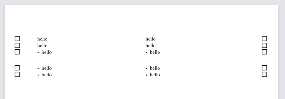
Ideally, every icon appears vertically aligned with the midpoint of the text line where it is called, and in either the left or right margin according to its column. There is no difference in behaviour between paragraphs, bullet points, etc. as to where the icon appears on either axis.