I started the document because I noticed a few subtle obstacles when writing Chinese in typst.
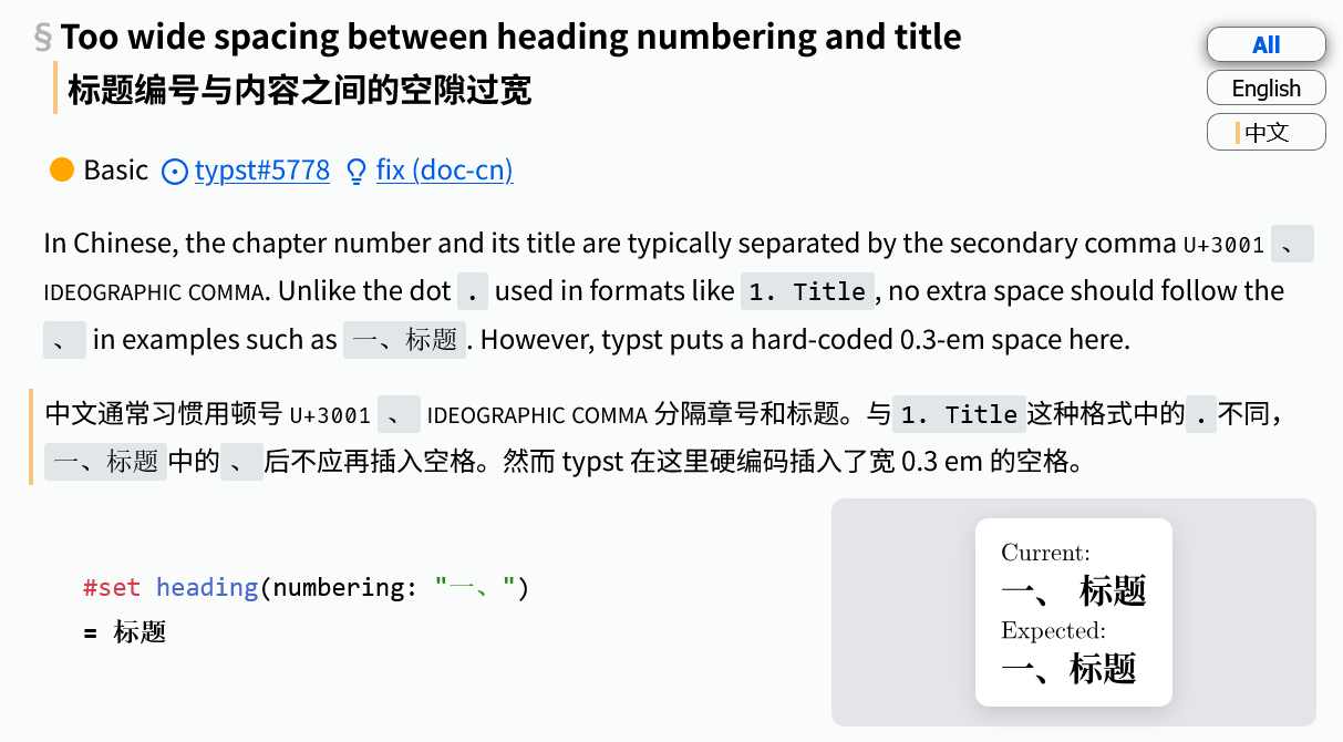
The issue shown in the image below might be the most notorious. While it may not appear to be specific to Chinese, it directly prevents effective use of Chinese numbering styles such as "一、". As a result, Chinese authors are often forced to either abandon this format, or resort to show h.where(amount: 0.3em): none. According to GitHub search results, 19 / 41 ≈ 46% authors apply this weird show rule.
Invisible issues
Moreover, I think the basic issues are kind of underrepresented in GitHub Issues.
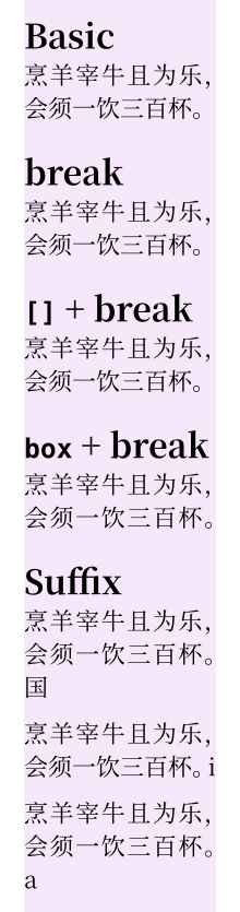
Professional guys often create workaronds and tend to report cool advanced issues, while average authors struggle silently with basics. Not all people have time/skill to report clean, reproducable, and fixable issues. There is a Chinese chat group focused on typst, and people are asking basic questions everyday. However, these questions rarely turn into GitHub Issues due to reporting barriers.
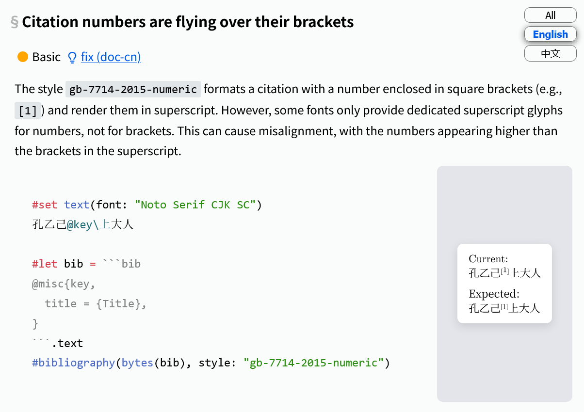
Another reason is the complexity of typography. The following issue is caused by an imperfect font. It hasn’t been reported in GitHub Issues (AFAIK), as it’s not typst’s fault. However, we can certainly provide a better default.
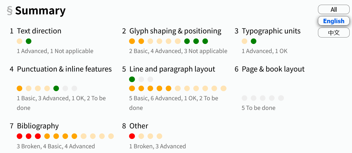
A structured overview
The document organizes issues using the same framework as the W3C clreq-gap for Web/ebooks. Each issue is categorized and marked with a priority level.
For this issue Strict grid aligned in both horizontal and vertical axes 严格纵横对齐的网格 a trailing #linebreak(justify: true) might be a good workaround for now, it seems to make a full grid alignment in for that example. Maybe you have other more difficult examples not covered by this.
This is maybe the 3rd time in the past few weeks where niche element fields are used in where clause. And from the looks of it, the niche ones are mostly elegant hacks, that ideally should have a better solution. It’s also not weird when you look at typst/crates/typst-library/src/model/heading.rs at 6fe6411bd8906d759022d87e2cb3525713bc4890 · typst/typst · GitHub. The spacing is always applied. Would you only remove the space if 一/壹 numbering is set and text.lang is zh?
What is a better default? I can only think of using a known font(s) for styling superscripts, but:
This means Typst must rely on some specific font(s) for this.
This font will probably not match your specified one, so it can look ugly.
AFAIK there is not a single place where Typst explicitly specifies fonts, other than the default 3, so it can mess up the code, by adding random text set rules under certain circumstances.
Setting this implicitly will make debugging why a random font is embedded in the PDF much harder.
You can’t fix this if you disable fallback fonts.
I assume you can fix this with a text regex show rule with superscript brackets and set your own font (a one-liner).
As for this specific problem (citation numbers are flying over their brackets), we could check if all characters in [1] have typographic superscript glyphs. If not, turn off for all characters.
It looks like this mechanism is already implemented for #super, but somehow broken in #cite. You could verify it by the following.
国@key // Bad
国#super[[1]] // Good
国#super("[")#super[1]#super("]") // Bad
#show cite: set super(typographic: false)
国@key // Good
The citation code is really hard to search around for content elements (without debugging), but, IIUC, there was a place where there is prefix/suffix, so perhaps cite does process them separately, and therefore it doesn’t account for overall glyph compatibility.
(I guess you know that I don’t read/write any east asian language, but I still think it’s interesting)
This case, that justified linebreak does not fix the last line to have punctuation treated the same way as other justified lines, seems like a bug of smaller scope (than grid layout) that could be reported separately, what do you think?
Hi bluss! I also noticed the behaviour, and I currently added a box (……三百杯#box[。]#linebreak(justify: true)) to generate the expected result. However, I don’t really know why it works…
I have been involved with Chinese for years. My immediate reaction was that since Chinese characters[1], including full-width punctuation, are monospaced, shouldn’t it be enough to:
#set par(justify: false)
if setting it to true causes that problem.
But then I am still new to typst, and am not likely to be setting large sections of Chinese.
Mark
[1] I don’t know what the situation would be with Japanese in view of the inclusion of katakana and hiragana.
Thank you. I must admit that my experience has been outside high-end, modern typesetting, and I didn’t factor in the use of Latin elements or Arabic/Roman numbers, since @bluss’ example didn’t include any.
As for the article, it looks very interesting but is very long and will now take me more time to read than I can probably give.
Anyway, thanks for sharing your idea.
I’ll add one or two sentences to explain why justification is commonly used in Chinese typesetting, and suggest disabling it if the text is simple enough.
In fact, full justification is so common in Chinese typesetting that some Chinese designers unconsciously apply it to Western typography.
As an example, the following photo was taken at Shanghai Pudong Airport in 2016 by the author of that website.