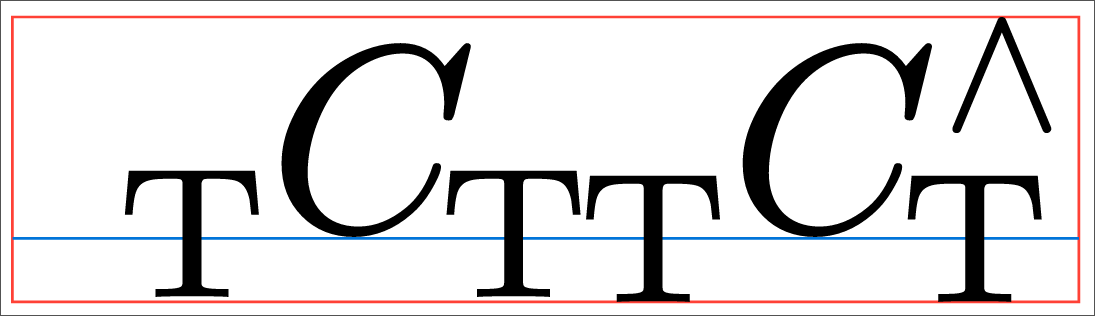
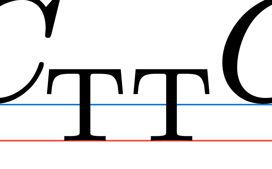
In the following example, the subscripts “T” in the middle have a different height. It seems typst aligns the bottom of the letter “C” (the blue line), but it really looks weird when the “T” letters are not aligned.
I guess this is intentional. It avoids the superscript and subscript from covering each other.
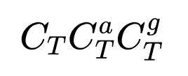
In LaTeX (with the font Computer Modern, not new), the effect is even more visible:
I did not know that LaTeX does this the same way. But I guess it makes sense that way.
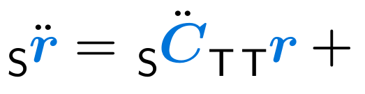
Also thank you for the suggestion. I thought of using the Place Function, but it was hard to make it perfectly aligned. The solution with the hide function seems better.
The only problem is that I have to adjust every equation by hand but this is fine for me
Maybe one can come up with a more sophisticated version, but I think it requires iterating the whole equation for attach functions and inserting hidden elements depending on the context. Just overwriting attach leads to side effects. E.g. also when having nested attach calls
Thus, not fitting the use case. But also this can be reverted with let attach = math.attach, or by defining the override inside a narrower nested scope.