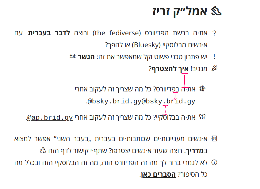
I made a site for helping Hebrew speakers on the fediverse and Bluesky connect better with each other on using Bridgy Fed bridge. It has a tutorial explaining how to use the bridge and a directory of Hebrew-language accounts which are on the bridge. The directory is produced in Typst using YAML files. The website is in Hebrew, but even if you don’t read Hebrew you might find the code interesting
The colours of the buttons are based on the Nord palette.
The icons, which I adore, are from Phosphor. They go very well With Open Sans.
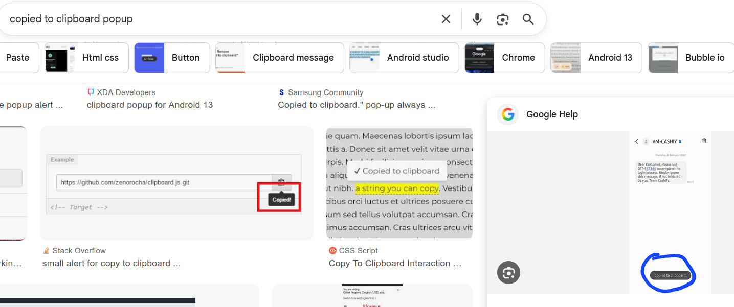
There’s no JavaScript anywhere except for copying the handles to the clipboard, which AFAIK cannot be done in HTML. IMHO JavaScript is acceptable in web apps (and even there it’s inferior to WebAssembly) but plain websites should strive to avoid it.
Please do share what these minor nits are. I’d like to learn and improve
handle_tables with links that are too long get truncated (if the viewport is compressed, on mobile, or even for a small number of ones in the unmodified desktop view). It should probably wrap somehow. [1]
If the names are right aligned, it may be more visually consistent to also have all the rows be right aligned (that is, the links as well). But I’m not sure how design for mixing RTL and LTR is usually done.
Along the same lines, it may be nice to have the icons on the right.
The links animate highlight on hold, but the standard is to have them highlight on hover.
There’s no clear feedback that clicking the links saves to the clipboard. I saw the link animation, but assumed all had no links for some reason. Some ideas:
 Live website
 Git repository: on Radicle or on Codeberg
 Typst text and code (I automated everything I could using the scripting language)