How can I customize Cetz plots with different axes, pallete, etc.?

Hello,
My code is :

#import "@preview/cetz:0.3.2": canvas, draw
#import "@preview/cetz-plot:0.1.1": plot

// Load CSV and separate first row from others
//mock data:
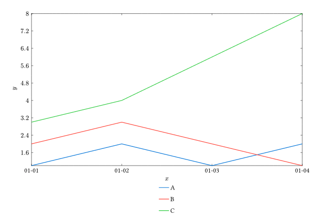
#let (names, ..data) = csv.decode(```
Date,A,B,C
2023-01-01,1,2,3
2023-01-02,2,3,4
2023-01-03,1,2,6
2023-01-04,2,1,8
```.text)

// Hack: use TOML parser to parse date strings
#let dates = data.map(x => toml.decode("date = " + x.first()).date)

// Each x value is the number of days since the first row date
#let xs = dates.map(x => (x - dates.first()).days())

// Make an array of (x, y) coordinates for the given column index
#let series(j) = range(data.len()).map(i => (dates.at(i), float(data.at(i).at(j))))

#canvas({
  import draw: *

  // Set-up a thin axis style
  set-style(
    axes: (   stroke:  (thickness: .5pt, dash: none, paint: auto), 
              tick: (stroke: .5pt)),
    legend: (stroke: none, orientation:ttb, item: (spacing: .3), scale: 80%),
  )

  plot.plot(size: (16, 9),  legend: "south",{
    for j in range(1, names.len()) {
      plot.add(series(j), label: names.at(j))
    }
  })
})

image

My question is,
Is it possible to have a predefined palette for A B C that would not change if plotted another time( another source)?
How to plot dates in the x axis instead of integers?

Hi, your minimal working example is not working.

The coordinates for the x-axis are generated incorrectly:
Panicked with: “Failed to resolve coordinate: (datetime(year: 2023, month: 1, day: 1), 1.0)”

I get the following data in the series(1) array:

(datetime (year: 2023, month: 1, day: 1), 1.0),
(datetime (year: 2023, month: 1, day: 2), 2.0),
(datetime (year: 2023, month: 1, day: 3), 1.0),
(datetime (year: 2023, month: 1, day: 4), 2.0),

Please fix your example code.

Hi, Yes you are right:
replace dates by xs in :

#let series(j) = range(data.len()).map(i => (dates.at(i), float(data.at(i).at(j))))

Sadly that does not help at all.

It’s the same code as in your first post and still the same error.
I had to add .day()to the x-coordinates of the data points.

plot.add(series(j).map(x => {(x.at(0).day(), x.at(1))}), label: names.at(j))

If you want to show dates on the x-axis you can set custom x-ticks with a value and a label:

x-tick-step: none,
x-ticks: series(1).map(x => (x.at(0).day(), [#x.at(0).display("[month]-[day]")]))

You can see the result here:
https://typst.app/project/rhSlsi9fLCvO02kqk9Vj5b

image

1 Like

Hi, that worked, thank you very much.
Do you know how to rotate the dates by 90 deg?

And if possible to change the legend text font size?