Matze
July 23, 2026, 11:21am
1
Trying to produce a plot n vs. % duty cycle. Duty cycle is of course limited to the range 0…100%, so I want my plot to start at 0.
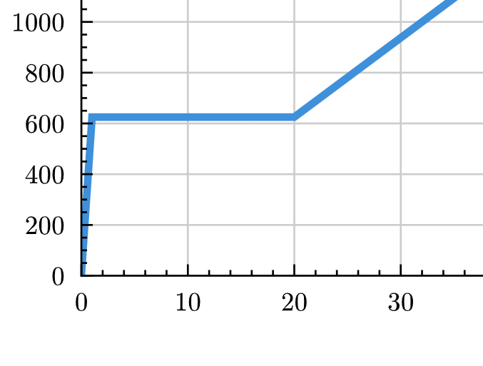
Unfortunately, my code makes the axes hide the point at (0,0):
Is it possible to arrange the plot in front of the axes?
This is my code:
#import "@preview/lilaq:0.6.0" as lq
#import "@preview/tiptoe:0.4.0"

#show lq.selector(lq.diagram): set text(
  size: .8em,
  font: "Arial"
  )

#align(center,
lq.diagram(
  width: 70%,
  height: 30%,
  // spine: (stroke: none),
  title: "Transfer curve",
  xlabel: "Set point [%]",
  ylabel: "n [rpm]",
  yaxis: (
    exponent: none,
    tip: tiptoe.stealth,
    mirror: false,
    lim: (0, auto),
    ),
  xaxis: (
    exponent: none,
    // tip: tiptoe.stealth,
    mirror: false,
    lim: (0, 100),
    ),

  lq.plot(
    (0,1,20,80,100),
    (0,625,625,2500,2500),
    mark: none,
    stroke: (2pt),
    )
))
MAX2
July 23, 2026, 1:31pm
2
If i get it correctly just change the xaxis lim to somsig like lim: (-1,100). And you can try inverting the tiks from this tutorial Tick configuration − Lilaq , also there is answer to your other question. Hope it helps
Matze
July 23, 2026, 2:18pm
3
Nope. Doesn’t work.
-1% helps displaying the plot, but does not exist as duty cycle.
inverting the ticks would help a little bit but the y axis would still be above the plot.
And with my other question: that’s why I am asking - It does not work like this.
MAX2
July 23, 2026, 7:03pm
4
MAX2
July 23, 2026, 7:46pm
5
#import "@preview/lilaq:0.6.0" as lq
#import "@preview/zero:0.6.1": set-num

#set-num(math: false)
#set page(margin: 5mm, paper: "a4")

#show lq.selector(lq.diagram): set text(font: "Arial")

#let data_x = (0, 1)
#let data_y = (0, 1)

#lq.diagram(
  width: 100%,
  height: 100%,
  lq.plot(data_x, data_y),
)
for example
Matze
July 24, 2026, 7:04am
6
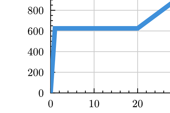
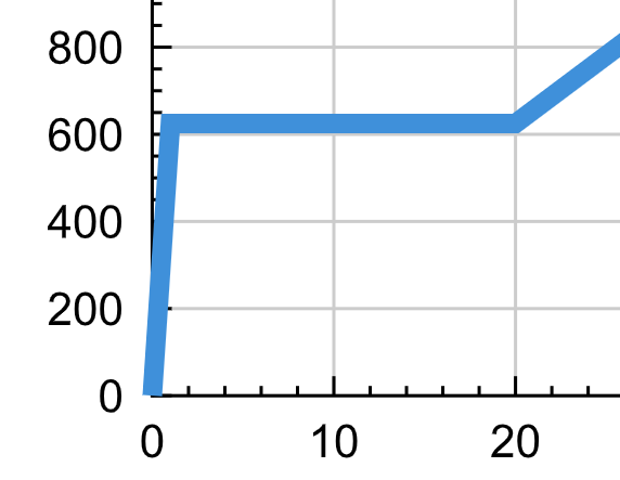
Yes, z-index works.
  lq.plot(
    (0,1,20,80,100),
    (0,625,625,2500,2500),
    mark: none,
    stroke: (3pt),
    z-index: 2090,
  )
However, it still looks a little bit ugly, as the plot line is cut by the plot area.
I have to take a closer look on how this is displayed as of now in excel and how it would be sensible.
Matze
July 24, 2026, 7:35am
7
We should better not mix up the Z-index thing and setting the font item. I believe they are two different things. That’s also why I made two separate threads for them.
Matze
July 24, 2026, 7:42am
8
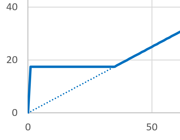
This is how excel draws a very similar plot as of now:
I think we are able to recreate his using lilaq.
MAX2
July 24, 2026, 8:57am
9
Is this same dataset? Anyway just removing tick lines and making the diagram border light gray, and maybe thinner, should do the thing. Also exel plot line looks thinner to
Tick configuration − Lilaq (seting inset and outset to 0)Axis configuration − Lilaq the last examlpe
Mc-Zen
July 24, 2026, 11:20am
10
Hi!
In addition to increasing the z-index to make the plot appear above the axes, you can set clip: false to switch off clipping to the data area. See plot − Lilaq .
Although, Excel also applies clipping as it seems.
Matze
July 24, 2026, 11:26am
11
It’s not the same, just similar.
Yes, this is achievable using available formatting…
THANKS!
Matze
July 24, 2026, 11:28am
12
You are right. clipping was the term I were missing.
Anyway, let’s see how we will style this in the end.