There are many things you are asking about in your post, but it is unclear what the actual question you want answered is.
Have you tried chaning the text weight? Alternatively, strong emphasis. Note that you’ll have to make sure the font you use supports changing the weight.
Are you asking how you can change the font? You gave an example on how to do that in your post
Yes it does?
#set text(font: "Linux Libertine")

the grey fox jumps over the lazy dog \
THE GREY FOX JUMPS OVER THE LAZY DOG
The included text looks to be a citation. Is there a particular reason you are typing it manually, instead of referencing a bibliography? Are you possibly asking how you can make the citation keys be bolded automatically?
Why not use smallcaps with Linux Libertine instead of Linux Libertine Capitals, which is just a subset of the same font (from what I could tell)? If it is indeed an issue with the font you’ve installed, using the standard font instead of a subset is more likely to include all the necessary features.
#set text(font: "Linux Libertine")

#smallcaps[*the grey fox jumps over the lazy dog*] \
#smallcaps[*THE GREY FOX JUMPS OVER THE LAZY DOG*]
At first: at the beginning I set Linux Libertine as default font. But after a while, when I looked for a nicer font I found Libertinus Serif better, but without Capitals.
Second: Yes I tried weight for Linux Libertine Capitals. Typst gives an issue for “Linux Libertine Capitals Bold”, I modified also some around with no effects. - Your proposal: it doesn’t look like Capitals and before I have to rewrite the Text from Dörfel to DÖRFELT
Third: yes its a reference to a manually created Biography. It is made from the author. To put it into Zotero or other bibs its a lot of work. And in my situation a reference to bibliograph produced digits, surrounded by a square. The solution for this I´ll try later. This is my first serious attempt using Typst to help a non-profit association.
It’s probably best to continue working as before. Thanks for your answer.
I tried it and using weight: "bold",strong[your text] or *your text* works. You have set the font to “Linux Libertine Capitals” and have “Linux Libertine Capitals Bold” installed, then Typst uses the bold style from it.
#text(font:"Linux Libertine Capitals", fallback: false, 11pt)[*Dörfelt et al.* (2002)]
I hope @flokl has answered your question. I’ll add a couple of notes which should clarify some things.
Indeed, if you capitalise the text it’ll use uppercase, not smallcaps:
#set text(font: "Linux Libertine")

#smallcaps[the grey fox jumps over the lazy dog] \
#smallcaps[THE GREY FOX JUMPS OVER THE LAZY DOG] \
THE GREY FOX JUMPS OVER THE LAZY DOG \
In case you want to change this in the future, you can just change the bibliography style
#set cite(style: "alphanumeric")

Test @test tells us ...

#bibliography(bytes(```
@article{test,
	title={How to test},
	author={Tester, Peter T.},
 year=1999,
}
```.text))
Mind this: there are different version of Libertinus Sans. The one available on Google fonts does not support some opentype font features (like smcp for small capitals), whereas the one on https://github.com/alerque/libertinus does support them. Maybe this caused your problem.
@Ayala
The result of your recommendation looks like this:
Result:
If small caps don’t appear for me, maybe it’s because I’m working offline with typesetter or Katvan?
I downloaded the whole package of Libertinus - However, no small caps are displayed in my font management.
I just work with the font as pre-included in the typst compiler. A google search told me all variants define the smallcaps
Maybe you are using a wrong font format, either from a previous installation or recent downloads (as mentioned by a former user, some available packages of the font are missing some features). But in any case there should be no need to download any font since it is pre-included.
If I were you I would make sure you are not using some weird installed version of the font.
I concur that this is almost certainly a font issue. If you have access to a terminal, you can check what version of each font typst is using and where they are installed with the command
typst fonts --variants
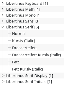
The default font that ships with the compiler should be something like
If Libertinus Serif is overridden by your OS or you’ve installed a different version it’ll look something like this (respectively) instead, depending on your OS:
And there is nothing overridden, NO windows. Your command doesn’t work in my desktop-installation with Typesetter.
If there is libertinus small caps, where can I find a URL for it?
As I have mentioned, they are included in the typst compiler. Which means I use it locally and I do not use the Typst app. There is no need to download anything because it is already included. There is nothing to find because there is not a separate file dedicated to small capitals, but a feature of the existing files.
Bold small caps works with Libertinus-7.051 from the linked GitHub repo when the OTF version is used. The TTF font version does not have small caps characters.
So you probably have to remove the TTF version or if you don’t need the font for something else, the complete font as the working font it is already bundled with the Typst compiler (as mentioned by Ayala).
Test setup
I compiled the following snipped:
#set text(font: "Libertinus Serif", fallback: false)

#smallcaps[*Dörfelt et al.*(2002)]
with
typst c main.typ --ignore-system-fonts --ignore-embedded-fonts --font-path ./Libertinus-7.051/static/OTF/
results in
typst c main.typ --ignore-system-fonts --ignore-embedded-fonts --font-path ./Libertinus-7.051/static/TTF/
¨Me neither. I cannot reproduce your issue on my windows machine using vsc + tinymist, compiling from the CLI, nor from a fresh install of katvan. I also tested compiling with both vsc + tinymist and the CLI on computers running macbook, linux and WSL with no success.
Locally, Typst uses your installed system fonts or embedded fonts in the CLI, which are Libertinus Serif, New Computer Modern, New Computer Modern Math, and DejaVu Sans Mono. In addition, you can use the --font-path argument or TYPST_FONT_PATHS environment variable to add directories that should be scanned for fonts. The priority is: --font-paths > system fonts > embedded fonts. Run typst fonts to see the fonts that Typst has discovered on your system. Note that you can pass the --ignore-system-fonts parameter to the CLI to ensure Typst won’t search for system fonts.
As they come with the compiler, you do not need to re-install them. If you have installed a different version of the font, the above tells us that you can pass the CLI argument --ignore-system-fonts to use the imbedded font. If it was a font issue, you should now be able to use smallcaps function.
You do not need to have a separate “Libertinus Serif Capitals” font installed to use the small capitals function. See also my first reply on this topic.
By typesetter do you mean typst? If the command does not work, how do you know nothing is overwritten? Note that you must have the typs CLI installed and that the command is typed into the terminal.
If you have installed any version of linux libertine, it is likely that the font is overridden, even if you did not intend for this to happen.