Hi. I have a typographical question. When I write a k with a hat over, the hat is unfortunately not centered correctly - it is especially bad if I use an upright sans serif font. Does anyone know of an elegant solution to this problem?
Here is a comparison of how it looks in Typst and LaTeX. I would like the result to resemble the LaTeX typography.
Thanks for your reply Sijo. Curious that we get different results.
I am using the latest Typst version (0.13.1) and the default math font.
To reproduce. Open an empty document in Typst. And paste the following code:
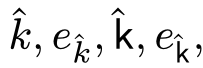
$
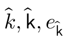
hat(k), e_(hat(k)), hat(upright(sans(k))), e_(hat(upright(sans(k)))),
$
This gives me the result:
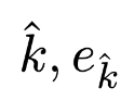
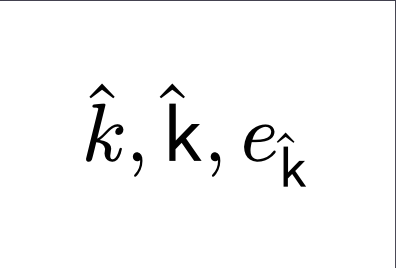
Compare this to LaTeXiT with the following preamble:
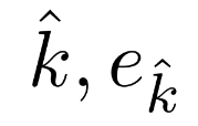
Minor detail: In my original example I had overwritten the weight of the math font, which means the accents had a little more vertical spacing than usual, but this is not related to my alignment issue. So now, I have explained the minimal reproducible example above.
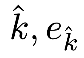
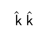
Also, a box can be used as a work-around, though it may have negative effects on other parts of the layout and will very quickly become annoying to enter into the document: