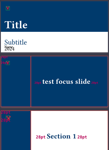
I am creating slides based on a streamlined version of the diatypst library. However, different heading levels have different size text despite what I explicitly set for reasons I can not understand.
While the implicit sizing of the headings makes some sense in the document, it messes with the rest of the layout. Especially on level 1, the text size is set to 28pt which changes the size of other elements on the page (e.g. a logo whose placement and size is meant to be consistent).
Lengthy example here.
Screenshot below the fold:
The green box is the actual size of the logo as I would like it to appear, the lobster emoji (![]() ) is the stand-in for the actual logo.
) is the stand-in for the actual logo.
I see three resolutions to the issue:
- Ensure every heading is the same, base, font size; manually control the sizing of only the heading text.
- Restrict the affect of the default heading scaling so solely the heading text and not the surrounding content.
- Manually specify the logo size in fixed units and try to enforce it’s placement and layout elsewhere in the template.
It’s not clear to me which, if any, are the correct or ideal approach. I think I would prefer 2, but have no idea where to look for how I would control this implicit sizing. I suspect there are also other options that I didn’t think of, too.
