but this does not work.
The following does seem to work:
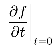
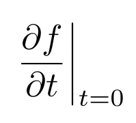
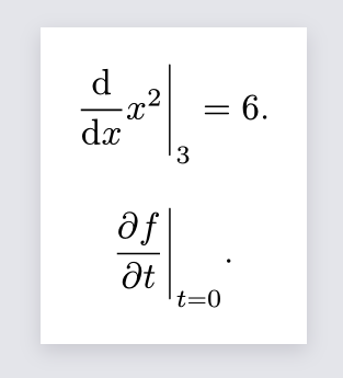
$ lr(dif / (dif x) x^2 |)_3 &= 6 $
but I am not sure if the spacing is correct and am uneasy about the document semantics now reflecting the subscript attaching to the expression as a whole, not the right delimiter.
Additionally, the above would not work if the expression had an unclosed left parenthesis, e.g.:
$ lr(\( sum^* |) $
will always size the parenthesis and the bar together, which is not necessarily desirable.
If there is no reliable way to do this currently, might I suggest the following change:
Make lr take optional named arguments left and right, which can be content, none, or auto. The default is auto, in which case the delimiter is inferred from the text. Otherwise the provided content is affixed and sized appropriately, unless none is used. Since math mode would not interpret none as a literal, perhaps a string can be passed instead, which is either interpreted as a delimiter, e.g. "(", "|", or "none", or "auto". Perhaps, in analogy to mat, a delim parameter could be provided, too, which would take either the left delimiter with an implicit mirrored right delimiter, or a tuple.
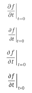
This is indeed the correct way to do it. As for the document semantics, it is obviously more complex to read than without lr, but it is only used here to specify that | must scale with the rest of the previous content.
About the subscript, it is not only semantics, but it is actually attached to lr.
I am unaware of a way to adjust these attachment points.
As to the semantic of attaching it to lr: I don’t think that that matters, as none of the output formats typsts support (PDF, PNG, SVG) have any such semantics. In the PDF, afaik it just creates the glyps/letterforms in specific locations on the page, but every association as to what is attached where is lost (even the distinction that something is a “subscript” as opposed to “regular math” or “regular text” is no longer present in the PDF) only implied to the sighted reader by placement and text size.
Thanks for the demo. However, since LaTeX’s math font is typically Computer Modern Math or New Computer Modern Math, I don’t think the font itself is the main issue. I suspect Typst might have some problems with how it handles delimiter attach. My understanding is that subscripts and superscripts for delimiters (especially stretched ones, like with \big) should generally align with the delimiter’s top and bottom boundaries, with only slight overflow. But I’m not familiar with the rendering principles of Typst or LaTeX, so this is just my speculation.
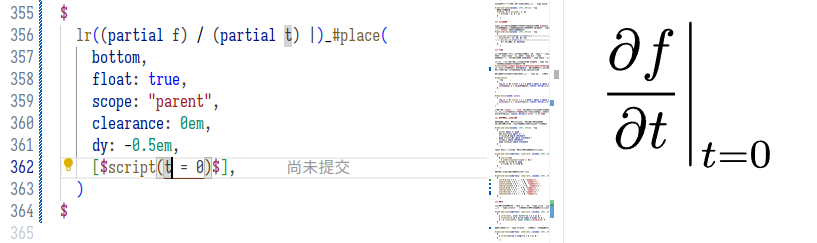
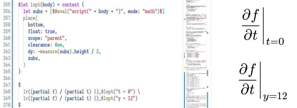
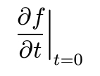
Anyway, thanks for the reply. For now, I’ve used place to simulate the LaTeX result, and I think Typst’s result is acceptable, though I’m still getting used to it.
LaTeX font handling is very bespoke (as it predates OTF Math) so it could also be that it places the attachments according to some internal algorithm independent of the font. (The built-in Computer Modern font is in the Metafont format, not OTF. What Typst uses is a “port”, imo one with some deficiencies)
(The same might be true for Typst, I dont actually know if OTF specifies math attachment points)