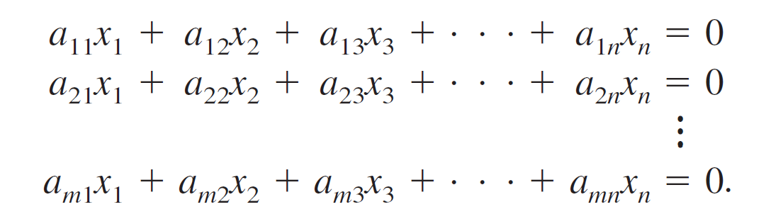
I like the spacing between terms in a textbook and want to recreate it in Typst. Here is the reference from my Linear Algebra book by Ron Larson (p. 21, 8th edition):
As you can see, the Typst render is more cramped, with less spacing between terms and operators/symbols. How can I adjust the spacing between terms to achieve the same look as the textbook’s render? And along the same vein, is there a symbol for more spaced out horizontal dots like that in the textbook?
Does using mat reduce the effectiveness of assistive technology like screen readers? I would like to preserve accessibility of equations as much as possible, that’s why I ask.
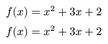
Additionally, it seems like the default spacing between terms in Typst is med or 2/9 em, as the following 2 lines of math code render the same:
$
f(x) &= x^2 + 3x + 2 \
f(x) &= x^2 med + med 3x med + med 2
$
Oh, I forgot about that feature. I think that would be sufficient for a select number of equations, but can maybe get cumbersome for a longer math document where you want to space out every term in that way. If there were a way to change the default spacing for math typesetting that would be ideal for stylistic consistency. Perhaps I should open a separate topic about changing default spacing?
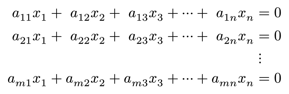
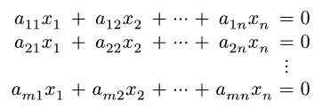
Are my eyes deceiving me? I find the first sample more cramped, in particular, the a and x are much too close together, looking much like what I get in Word. The second sample is more harmonious, and the spacing around plus looks very similar.
As for the ellipsis, in the first sample they appear to simply be three individual dots, not a proper ellipsis, which is a single symbol. Also note that the vertical and horizontal ellipses are inconsistent in the first sample, but consistent in the second.