Hi,
I’m trying to align these 3 lilaq plots. every plot gets set to the same width and the alignment in subpar is set to top + right. Maybe someone here has an idea what I’m missing :)
Example code
#{
import "@preview/subpar:0.2.2"
import "@preview/lilaq:0.4.0" as lq
import "@preview/fancy-units:0.1.1": *
let plot_width = 10cm
let subplot_height = 4cm
let T = 2.0 // total duration
let s(t) = 3 * calc.pow(t / T, 2) - 2 * calc.pow(t / T, 3)
let s_dot(t) = (6 * (t / T) - 6 * calc.pow(t / T, 2)) / T
let s_ddot(t) = (6 - 12 * (t / T)) / calc.pow(T, 2)
// Vector helpers (element-wise ops for 3D tuples)
let vec_add(a, b) = (a.at(0) + b.at(0), a.at(1) + b.at(1), a.at(2) + b.at(2))
let vec_sub(a, b) = (a.at(0) - b.at(0), a.at(1) - b.at(1), a.at(2) - b.at(2))
let vec_scale(s, v) = (s * v.at(0), s * v.at(1), s * v.at(2))
let q0 = (calc.pi, calc.pi / 2, 0)
let qf = (calc.pi / 2, -calc.pi / 4, calc.pi / 3)
let dq = vec_sub(qf, q0)
let q(t) = vec_add(q0, vec_scale(s(t), dq))
let q_dot(t) = vec_scale(s_dot(t), dq)
let q_ddot(t) = vec_scale(s_ddot(t), dq)
let n = 200
let ts = lq.linspace(0, T, num: n)
show lq.selector(lq.legend): set grid(columns: 6)
// -- figure --
subpar.grid(
figure(
lq.diagram(
// title: [Cubic time-scaling along a joint-space path],
xaxis: (
label: [Time $t$ / #unit[s]],
),
yaxis: (
label: [Positions $q$ / #unit[rad]],
locate-ticks: lq.locate-ticks-linear.with(unit: calc.pi),
format-ticks: lq.format-ticks-linear.with(suffix: math.pi),
),
width: plot_width,
height: subplot_height,
legend: (position: center + bottom, dy: -100%),
lq.plot(ts, ts.map(t => q(t)).map(q => q.at(0)), mark: none, label: [Axis $1$]),
lq.plot(ts, ts.map(t => q(t)).map(q => q.at(1)), mark: none, label: [Axis $2$]),
lq.plot(ts, ts.map(t => q(t)).map(q => q.at(2)), mark: none, label: [Axis $3$]),
),
), <fig:trajectory-example-cubic-q>,
figure(
lq.diagram(
xaxis: (
label: [Time $t$ / #unit[s]],
),
yaxis: (
label: [Velocities $dot(q)$ / #unit[rad/s]],
),
width: plot_width,
height: subplot_height,
legend: none,
lq.plot(ts, ts.map(t => q_dot(t)).map(qd => qd.at(0)), mark: none, label: [$dot(q)_1$]),
lq.plot(ts, ts.map(t => q_dot(t)).map(qd => qd.at(1)), mark: none, label: [$dot(q)_2$]),
lq.plot(ts, ts.map(t => q_dot(t)).map(qd => qd.at(2)), mark: none, label: [$dot(q)_3$]),
),
), <fig:trajectory-example-cubic-qdot>,
figure(
lq.diagram(
xaxis: (
label: [Time $t$ / #unit[s]],
),
yaxis: (
label: [Accelerations $dot.double(q)$ / #unit[rad/s^2]],
),
width: plot_width,
height: subplot_height,
legend: none,
lq.plot(ts, ts.map(t => q_ddot(t)).map(qdd => qdd.at(0)), mark: none, label: [$dot.double(q)_1$]),
lq.plot(ts, ts.map(t => q_ddot(t)).map(qdd => qdd.at(1)), mark: none, label: [$dot.double(q)_2$]),
lq.plot(ts, ts.map(t => q_ddot(t)).map(qdd => qdd.at(2)), mark: none, label: [$dot.double(q)_3$]),
),
), <fig:trajectory-example-cubic-qddot>,
columns: 1fr,
align: top + right,
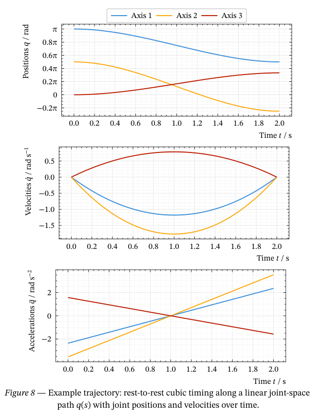
caption: [Example trajectory: rest-to-rest cubic timing along a linear joint-space path $q(s)$ with joint positions and velocities over time.],
label: <fig:trajectory-example-cubic-lq>,
)
}