Hi everyone,
i was wondering if there was a method to get either better typesetting or at least more control in the follow scenario:
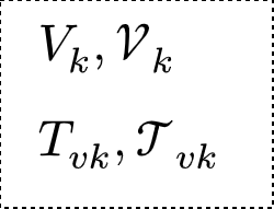
I want to write a letter in math mode in “cal” font and attach a subscript, e.g., $cal(V)_k$ and the subscript should be closer to the capital letter.
Compare for example the behavior of $V_k$, where the subscript gets “pulled in” a bit under the V.
An even more extreme example is the letter “T”, see image below:
A new version of the math font was recently released, which improves the spacing between calligraphic letters and subscripts. It will probably be updated on the Typst side very soon, but in the meantime, you can download the three variants of the NewCMMath font here and use them instead (by uploading them to the web app, or by using the --font-path parameter on your local compiler).
Hi Eric,
thank you for the information. I use VSC with Tinymist on my PC, so i downloaded the fonts, copied them into /usr/share/fonts/opentype and ran sudo fc-cache -f -v. Afterwards i added
#show math.equation: set text(font: "New Computer Modern Math")
which does compile, but does not seem to change at all how my equations look like. Any ideas for what is happening? If i use another math font, for example “STIX Math”, it does change the look of my equations.