How to show line of best fit with Lilaq?

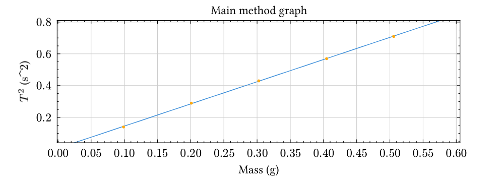
I’ve got a set of data points plotted with the below code, I have externally calculated that the line of best fit should be with the equation y=1.41119x but the current method of plotting it by manually calculating two points along it and using lq.line() is not the most readable in the code, and it also seems to not be possible to make the line of best fit go to the edge of the plot without manually scaling the axis.

Is there a way to either automatically draw a line of best fit for the data, or add on a line described by a y intercept and gradient?

Current code:

#align(center)[
  #lq.diagram(
      title: [Main method graph],
      xlabel: [Mass ($#unit[g]$)],
      ylabel: [$T^2$ ($#unit[s^2]$)],
      width: 90%,
  
      lq.scatter(
        (0.09883, 0.20096, 0.30255, 0.40468, 0.50568),
        (0.14,0.29,0.43,0.57,0.71),
        
      ),

      // y=1.41119x
      lq.line(
        (0,0),
        (0.50568,0.711542328),
        stroke: (
          dash: "dashed",
        )
      )
  )
]

Current graph:

Notice how the line does not go all the way to the edge of the graph - I’m aware this can be done manually by scaling the axis, but an automatic solution would be better.

Your code is incomplete and doesn’t compile, so I have done some guesswork in this code.

#import "@preview/lilaq:0.5.0" as lq

#let unit(x) = x // FIXME:

#let linear-regression(xs, ys) = {
  let len = xs.len()

  let x_mean = xs.sum() / len
  let y_mean = ys.sum() / len

  let sum_dx2 = xs.map(x => calc.pow(x - x_mean, 2)).sum()
  let sum_dxdy = xs.zip(ys).map(((x, y)) => (y - y_mean) * (x - x_mean)).sum()

  let a = sum_dxdy / sum_dx2
  let b = y_mean - a * x_mean

  (a, b)
}

#let xs = (0.09883, 0.20096, 0.30255, 0.40468, 0.50568)
#let ys = (0.14, 0.29, 0.43, 0.57, 0.71)

#let (a, b) = linear-regression(xs, ys)
#let best-fit-line = x => a * x + b

#let margin = 0.1

#align(center)[
  #lq.diagram(
    title: [Main method graph],
    xlabel: [Mass ($#unit[g]$)],
    ylabel: [$T^2$ ($#unit[s^2]$)],
    margin: 0%,
    width: 90%,

    lq.plot(
      mark: none,
      lq.linspace(
        calc.min(..xs) - margin,
        calc.max(..xs) + margin,
      ),
      best-fit-line,
    ),

    lq.scatter(xs, ys),
  )
]

My solution is based off How do you draw a trend line in typst? and consequently Linear regression · lilaq-project · Discussion #113 · GitHub

One problem with this code is, it doesn’t give y=1.41119x, but roughly y=1.39 + 0.005, so did you want a line with b=0? Then the linear-regression function needs to change.

Another problem is that I have to hardcode a margin value and use that when computing the linspace for the lq.plot, not really ideal if the data points can vary in orders of magnitude…

1 Like

I belive this function can be used to compute a for a trendline that passes through origin:

#let linear-regression(xs, ys) = {
  let sum_x2 = xs.map(x => calc.pow(x, 2)).sum()
  let sum_xy = xs.zip(ys).map(((x, y)) => x * y).sum()

  sum_xy / sum_x2
}
1 Like

Ah I see, I’ll have to implement a regression algorithm manually. Thanks for the help!

Please mark one of my answers as a solution, if you think this thread is solved!

Welcome to Typst forums!

1 Like