Recently, I have encountered significant difficulties in designing book layouts that imitate ancient Chinese texts. The layout of classical Chinese books differs greatly from that of modern books, and I am almost at a loss as to how to proceed.
Since many people may not have seen ancient Chinese books, I am including an example image below, followed by an explanation of the main typesetting challenges.
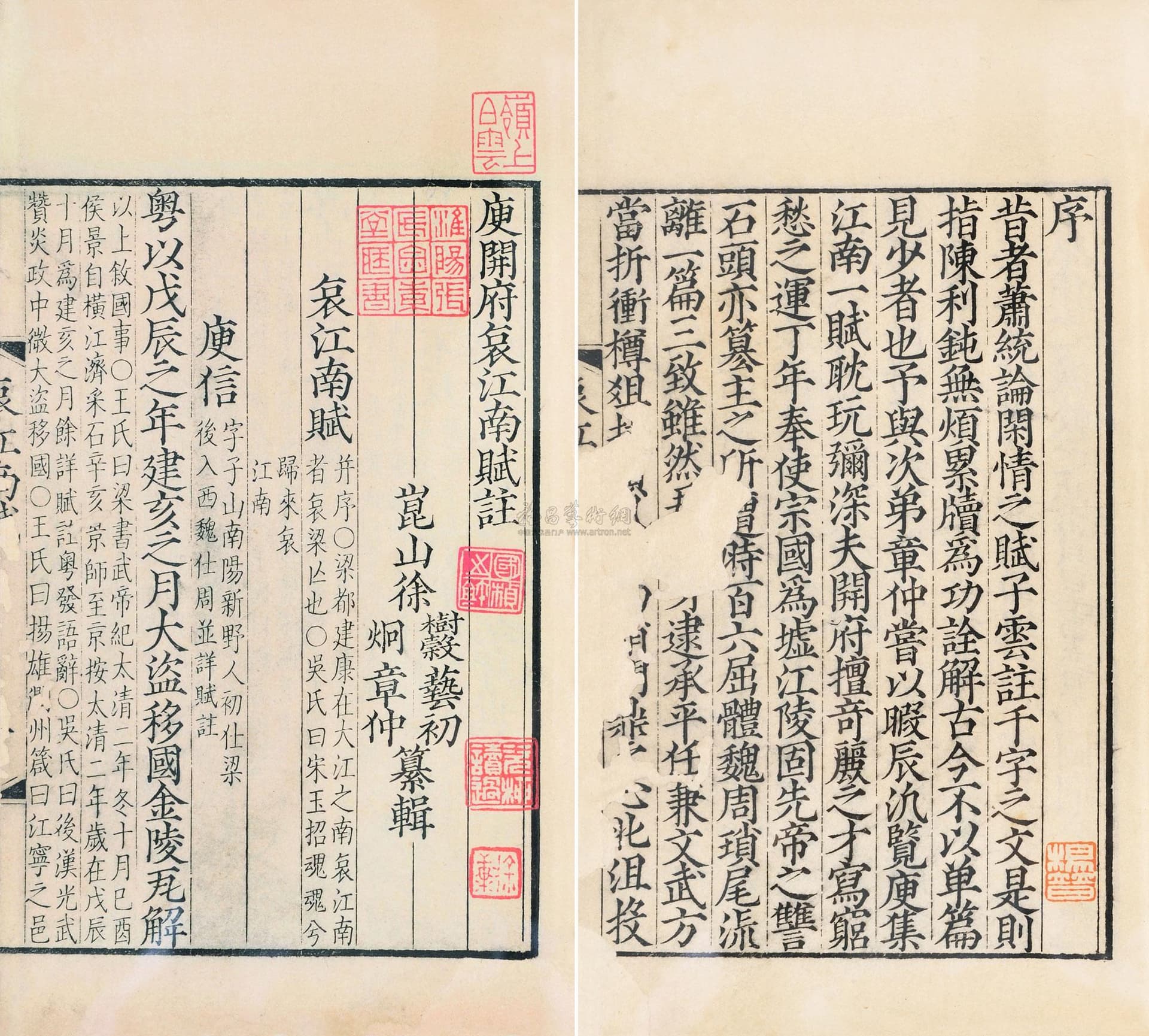
- The text in ancient Chinese books is written vertically. As shown in the image, reading begins at the upper right corner and ends at the lower left corner. This is very different from the reading order in modern books, which already poses a challenge.
- In classical Chinese texts, annotations (commentaries) are embedded directly within the main text. The only distinction is that annotation text is typically smaller (often half the size of the main text) and arranged in double-column vertical format. Sometimes, when the annotation is short, it may span a line break, and after the annotation ends, the main text resumes. Using English letters as a rough approximation, it might look like this:
A B C D [ E F G / H I J ] K L M N
(where brackets [ ] indicate annotation, and / indicates a line break within annotation)
Once these two main issues are addressed, the remaining problems are relatively more straightforward. For example:
- In a two-page spread, vertical text appears on both the left and right pages, with only half of certain characters visible. This is because ancient Chinese books were made by folding a large sheet of paper in the middle to form two pages.
In the center fold (gutter), it is usually the book title rather than the main text — similar to modern headers and footers. - ther concerns such as line breaks, page breaks, different fonts, inserting formulas (which in Chinese classics are often written horizontally within paragraphs), inserting images (illustrations or seals), and borders — these seem less difficult than the two main issues mentioned above.
I have searched online for a solution but found nothing satisfactory. Code generated by DeepSeek also did not work well. Therefore, I am reaching out for help.
Any examples, code snippets, or pointers would be greatly appreciated.
Thanks in advance!