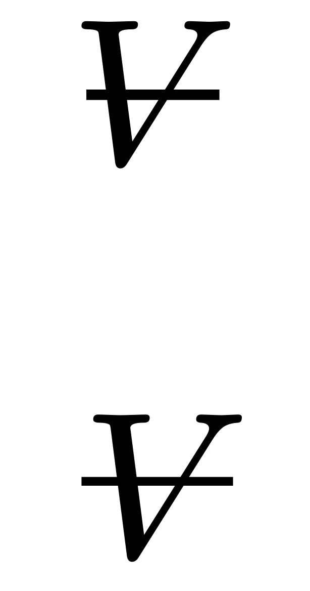
I’m preparing some fluid mechanics notes and I need to typeset a symbol for volume that looks like a capital V with a horizontal stroke through the middle.
In many engineering textbooks, this symbol is used to represent volume to avoid confusion with V for velocity.
Referring to the code listing below, in vol1 I tried using the cancel function but the stroke becomes noticeably thin at larger text sizes.
In vol2, I managed to get a somewhat acceptable result by hacking around with attach, but the solution is messy and ugly.
I also tried (and failed ) to use overline but it is extremely limited in math mode.
Are there any better approaches or other built-in functions that I might have missed to achieve a consistent and better result.
I think your solution with $vol2$ is great. I can understand it might feel hacky, but imo it actually looks like a pretty robust, simple solution. I’ve come to believe that typesetting is actually a pretty complicated task, much moreso than I previously thought given how easy it is to just write things out. Thus anything you can do with just a few functions to me is actually pretty elegant.
You said its output was “somewhat acceptable”, where does it fall short?
As far as the thinness issue goes for cancel, you can use the stroke command to overcome that issue as you did in the second approach:
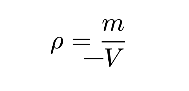
For vol2, I was not happy with the behavior of the line when changing the math font and the font size.
By subtracting 0.1em instead of 2pt, I think I get a better consistent result.
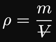
For now, I think I will settle with vol2 in the below code.