Bit of background - I have just submitted my PhD in Chemistry which I wrote in Latex (via Overleaf) and was reasonably happy with that. All of the graphs in my thesis were generated in OriginPro and exported as .png for compilation into Latex, but I have since discovered the world of typst and lilaq and am attempting to switch all of my future research reports/journal publication drafting etc. to typst. My use case is pretty simple but I’m relatively new to the language of typst and I guess coding in general, but am keen to learn.
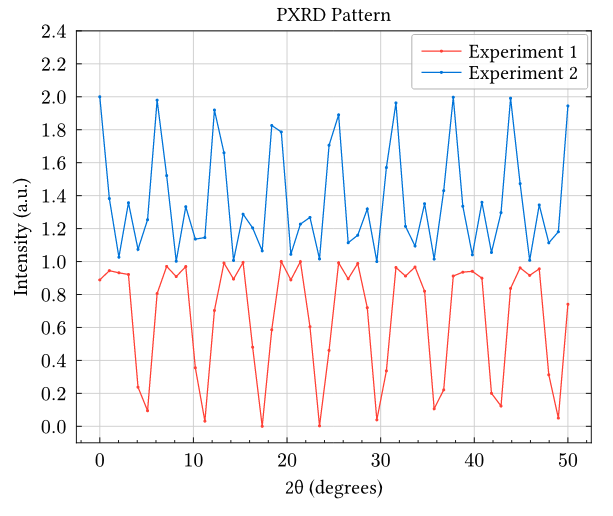
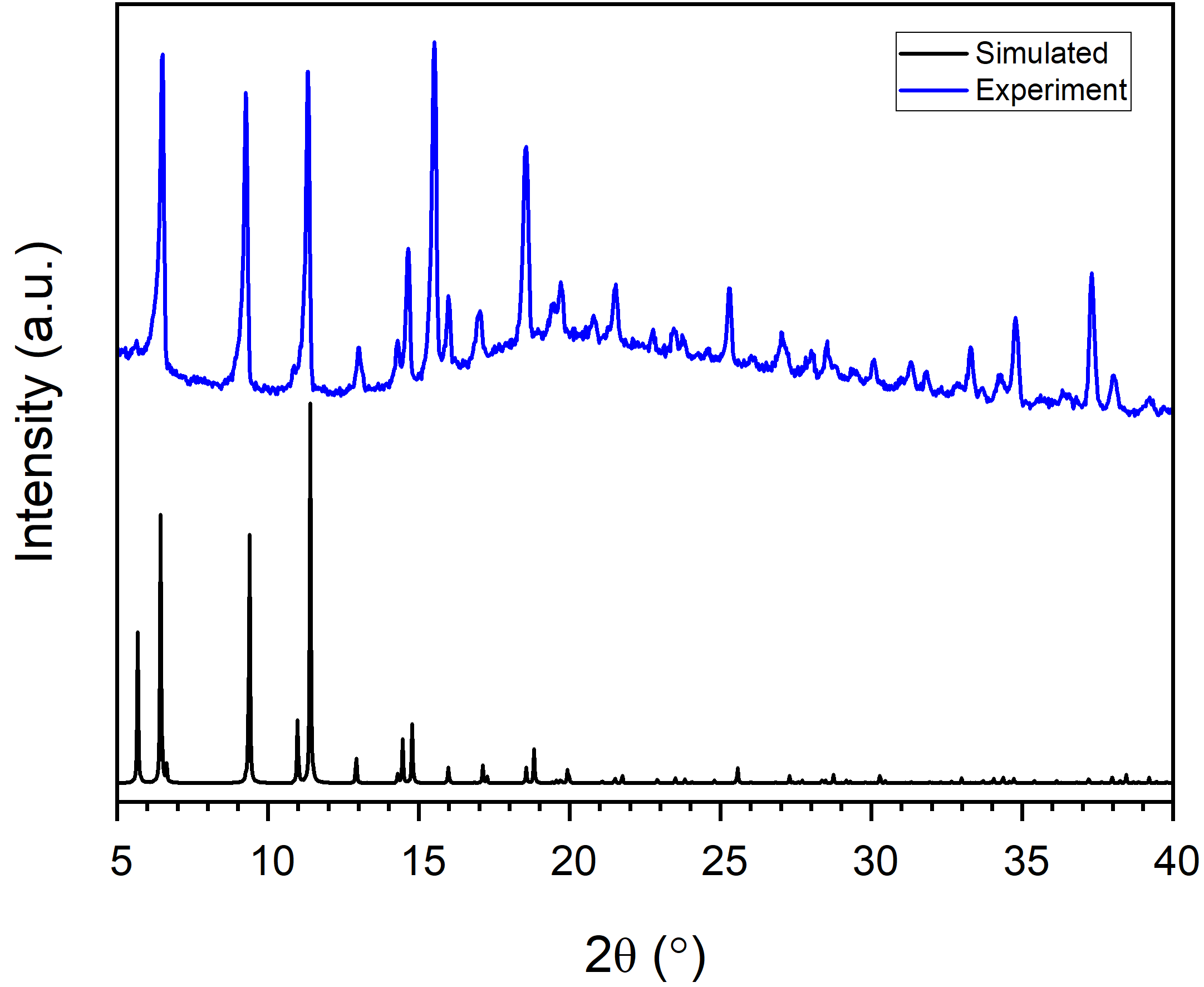
I have been able to get lilaq to work in reading data from two csv files containing the data I want to plot and it produces a nice overlay graph (attached) using this code. What I would like to produce is is a graph similar to the attached image which plots multiple datasets which are normalised (i.e., the y-values in column 2 of Dataset 1 are scaled such that they are divided by the highest value in that column, resulting in y-values between [0,1], and then same for Dataset 2. I would then like to be able to stack them by a constant value (i.e. offset the y-values for Dataset 2 by 1). It doesn’t seem to let me upload the csv files as I’m a new user, but am sure an example could be made with any kind of curve to illustrate the point.
#import "@preview/lilaq:0.5.0" as lq

#let (x, y) = lq.load-txt(read("PXP2291_RW211g_Cuthz-R-3m_DMF_12min.csv"))
#let (q, r) = lq.load-txt(read("PXP2290_RW211f_Cuthz-R-3m_DMF_12min.csv"))

#lq.diagram(
  width: 10cm,height: 8cm,
  xlim: (3, 30),
  ylim: (0, 9000),
  legend: (position: top + right),
  margin: (top: 20%),
  xaxis: (subticks: 4, mirror: (ticks:false)),
  yaxis: (subticks: none),
  title: [PXRD Pattern],
  xlabel: [2θ (degrees)],
  ylabel: [Intensity (a.u.)],
  lq.plot(x, y,
    label: [Experiment 1],
    mark-size: 2pt,
    color: red,
    smooth:false),

    lq.plot(q, r,
    label: [Experiment 2],
    mark-size: 2pt,
    color: blue,
    smooth:false),

)
Any help would be greatly appreciated!