I’ve been using the Typst Web App extensively on mobile devices like smartphones and tablets, and I’ve noticed a few usability issues that could significantly improve the experience if addressed.
Preventing Unintentional Preview Rotation
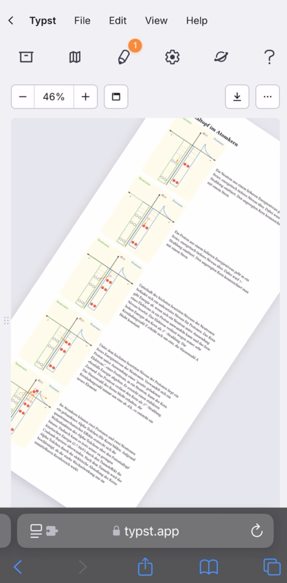
Currently, when using touch gestures on a mobile device, the preview pane can be freely rotated. This seems to be triggered by a specific multi-touch input event. However, excessive rotation often causes the webpage to crash entirely. This makes zooming in precisely very difficult, as accidental rotations frequently occur.

Would it be possible to identify which touch event is responsible and disable rotation? This would prevent instability and make interactions with the preview pane much more reliable.
I’ve recorded a video demonstrating the issue, which I’ll link here:
Allowing the Editor-Preview Split to Be Resized on Touch Devices
On desktop, dragging the divider between the editor and the preview allows users to resize both panes dynamically. However, on mobile devices, there’s no way to adjust the layout since it requires a mouse-based interaction.
It would be great if this functionality could be added for touch devices—perhaps by enabling a touch-and-drag event for the divider. This would make working on mobile much more flexible.
Considering a Touch-Friendly Context Menu (Feature Request)
On mobile devices, right-clicking isn’t possible. While not a critical issue, it would be a great quality-of-life improvement if a context menu could be accessed via long-press or a two-finger tap. This could allow for features like quick copying, inserting templates, or preview options, similar to how right-click works on desktop.
I believe many users would benefit from a more touch-friendly version of Typst, especially on tablets, which are becoming an increasingly popular tool for coding and writing.
Would love to hear your thoughts on these suggestions!