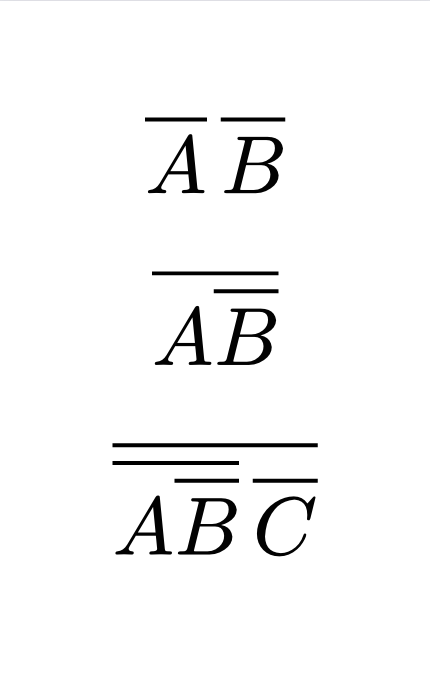
I’m typesetting Boolean equations and am migrating from TeX to Typst. When I have literals next to each other, the result looks super ugly:
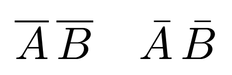
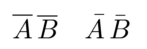
$overline(A) overline(B)$
Shows the overline over “A” slightly higher than that one over “B”. How can I fix this without having to explicitly name offsets (I do want nested overlines to “just work” like in TeX).
Thanks in advance!
Sidenote: I’m well aware that !(AB) != !A !B but this is just to demonstrate the point.
Typst is more like LaTeX + unicode-math. It extracts typographical metrics from OpenType data tables embedded in the font, rather than inventing its own values.
This tech stack is more ideal and more flexible, but it requires the coordination of the layout software (Typst / unicode-math), the OpenType standard, and the font, which leads to various minor issues.
In contrast, LaTeX (without unicode-math) plays all three roles because it predates everything, and hence usually produces better results.
In this case, overbarVerticalGap looks like the relevant OpenType metric. Quoting the standard:
MathValueRecord | overbarVerticalGap
Distance between the overbar and the (ink) top of the base. Suggested: 3 × default rule thickness.
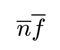
As you can see, it doesn’t define the absolute vertical position of overbars… I guess this design is intended to handle small letters (compare n vs. f), and doesn’t take into account capital letters.