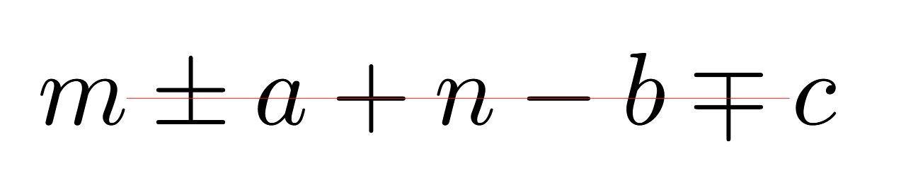
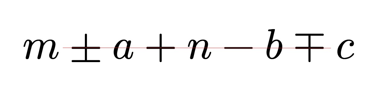
I don’t think there is anything intrinsically wrong with one or the other I think they both look great (it’s simply a design choice), however, shouldn’t Typst be able to recreate the exact LaTeX look?
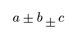
@mkorje is the most knowledgeable about math layout, but if you wanted to align it like latex manually, you can try by fiddling with the move function like below. I also wrapped in an explicit math.op call to keep the general operator spacing.
#let shiftop(op) = math.op(move(op, dy: .2em))
#let custom = shiftop(sym.plus.minus)
$ a plus.minus b custom c $
I’m not 100% sure, but I think you are comparing two different fonts (Computer Modern vs.New Computer Modern), in which case it could simply be a difference in font design.