I’ve just tried to replicate the rosters in《现代汉语词典》(The Contemporary Chinese Dictionary).


It’s used as a test case for a package:
I’ve just tried to replicate the rosters in《现代汉语词典》(The Contemporary Chinese Dictionary).
It’s used as a test case for a package:
Yesterday I didn’t have time. Now I’ll add some (hopefully interesting) details.
Most Chinese names contains three and only three characters. Moreover, all Han characters have the same width. Therefore, A Chinese name list can be easily aligned with a rhythm of three characters. This convention applies to both horizontal and vertical writing modes.
Source of the above image: The Type — 文字 / 设计 / 文化 » 中文排版网格系统的五大迷思.
And yes, there are exceptions.
王 力. (Here I put a U+3000 CJK Symbols and Punctuation IDEOGRAPHIC SPACE.)I guess this layout is unique? I can’t image how to align names like Nyota Uhura, James Tiberius Kirk, Montgomery Scott, or Beverly Crusher.
Please let me know if I am wrong. It would be fun to compare cross-cultural differences.
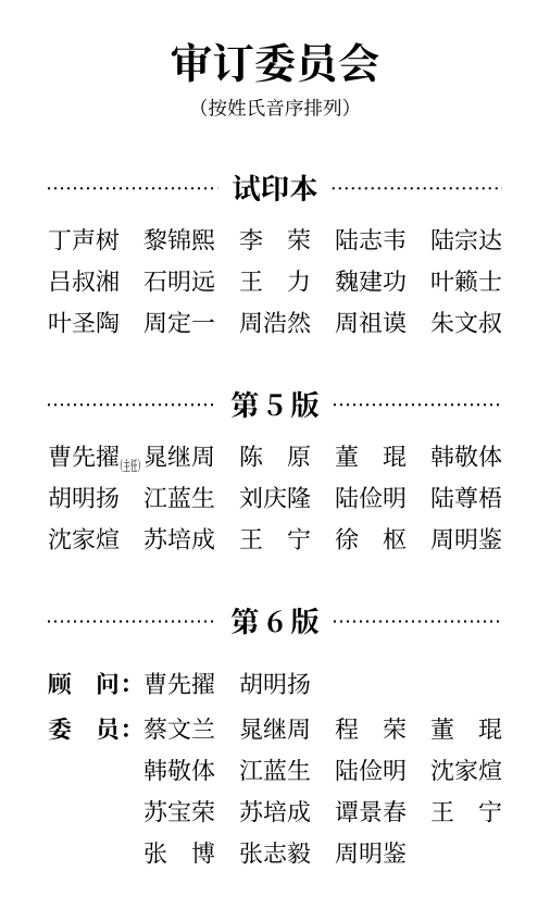
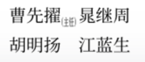
In the first page, there is a annotation(主任)after 曹先擢.
In normal cases, Han characters and punctuation are squares with the ratio of 1:1. However, (主任) is severely shrunk because of the lack of space. This can be achieved in typst by the following steps.
Turn ( and ) from 1:1 squares into 2:1 rectangles by inserting negative horizontal spacings.
show "(": it => h(-0.5em) + it
show ")": it => it + h(-0.5em)
Scale the whole annotation.
box(scale(x: 50%, reflow: true)[(主任)])
reflow: true is necessary. Otherwise, the next name 晁继周 would think the annotation is still holding 4 em space, and move to the next column.
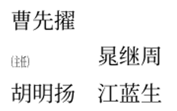
The box is also inevitable. scale creates a block-level container. If we do not wrap it in an inline box, then we’ll get the following.
Render it in subscript.
Allow the cell of 曹先擢 to overflow into the column gap.
In my package tricorder, (overflow: true) does the job.
To wrap up:
#tricorder(
  ((overflow: true), [曹先擢#sub(box(scale(x: 50%, reflow: true)[(主任)]))]),
  .."晁继周、陈原、……、周明鉴".split("、"),
)
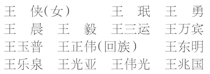
Besides, there is another way to annotate: just write as if it is a part of a long name. In the following image, (女)and (回族) are annotations.
Source of the above image: The newspaper People’s Daily on 2012-11-08.
Note that ( and ) are shrunk into 1:2 rectangles, even though there’s enough space for 1:1 squares.
I didn’t understand the purpose before I replicate it: If I don’t shrink them, the annotation would be placed at the midpoint between two names, leading to ambiguity! For example, 王正伟(回族)王东明 is 王正伟 (回族) + 王东明 or 王正伟 + (回族) 王东明?
Compare 主要修订人员 with 资料人员 in the second page, and you will find there are additional spaces between the characters in 主要修订人员.

The implementation is simple in typst:
let it = "主要修订人员"
let n = it.clusters().len()

// https://typst.app/docs/reference/text/text/#parameters-tracking
set text(tracking: 1em / (n - 1))
it
The motivation of putting additional spaces is to align 主要修订人员 with 主编 丁声树 and 协助 李 荣.
All Han characters are squares, and there isn’t any space between words. As a result, increasing the tracking is acceptable in this case.
However, it’s unusual for Latin texts.
Anyone who would letterspace lower case would steal sheep.