HI everyone,
This is my first interaction with this forum :)
I want to know how could i plot time-series charts using lilaq, if its is possible.
As you can guess i need datetime on x-axis and numerical values on the y-axis.
I tried converting the datetime to integer and then plotting against that but in vain.
I would prefer not to convert the datetimes to string since i also require to visualize the change in frequency in certain graphs.
This can be considered a small example which i am trying to get working and will eventually be programatically generating the graphs through an API.
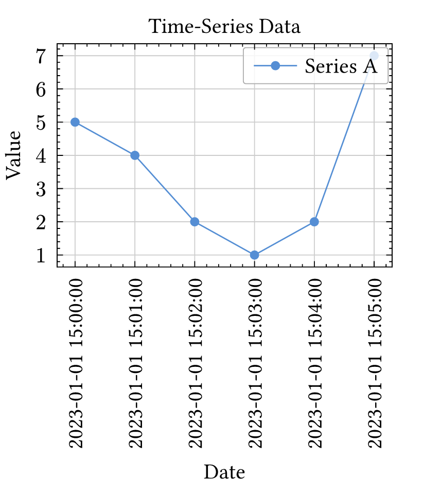
#let dates = (
  datetime(year: 2023, month: 1, day: 1, hour: 15, minute: 00, second: 00),
  datetime(year: 2023, month: 1, day: 1, hour: 15, minute: 01, second: 00),
  datetime(year: 2023, month: 1, day: 1, hour: 15, minute: 02, second: 00),
  datetime(year: 2023, month: 1, day: 1, hour: 15, minute: 03, second: 00),
  datetime(year: 2023, month: 1, day: 1, hour: 15, minute: 04, second: 00),
  datetime(year: 2023, month: 1, day: 1, hour: 15, minute: 05, second: 00),
)

#let values = (5, 4, 2, 1, 2, 7)

#lq.diagram(
  title: [Time-Series Data],
  xlabel: [Date],
  ylabel: [Value],
  xticks: dates.map(d => d.display()),
  lq.plot(dates, values, mark: "o", label: [Series A]),
)
any help or guidance would be appreciated, thanks!