This is a request for an autogenerated Typst logo similar to the /LaTeX logo in features so that we may reference the typesetting program used.
1 Like
I think this was discussed before and won’t be implemented, because it’s meant to be written as normal text, i.e. just as “Typst”, without any logo.
2 Likes
#let typst = {
  set text(
    size: 1.05em,
    font: "Buenard",
    weight: "bold",
    fill: rgb("#239dad"),
  )
  box({
    text("t")
    text("y")
    h(0.035em)
    text("p")
    h(-0.025em)
    text("s")
    h(-0.015em)
    text("t")
  })
}

Hello #typst
Preview:
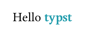
I created this simple snippet to mimic the Typst logo, but you’ll need to install the Buenard font first. If you don’t want that color, you can simply remove it from the code. Also, I’m not sure if using this font or logo might cause any potential legal issues.
Hi @nervosys, welcome to the Typst forum!
Regarding the idea of typesetting “Typst” specially: please don’t ![]()
- It’s ugly in the sense that it breaks the homogeneity of paragraphs.
- It doesn’t make sense: it makes something stand out for no “semantic” reason.
- Once you have a logo command, some people will feel it’s the right way to write the name and if you don’t use it you’re doing it wrong.
I’ll reproduce a quote by the famous typographer Robert Bringhurst (found here):
Logograms pose a more difficult question. An increasing number of persons and institutions, from archy and mehitabel to PostScript and TrueType, now come to the typographer in search of special treatment. In the earlier days it was kings and deities whose agents demanded that their names be written in a larger size or set in a specially ornate typeface; now it is business firms and mass-market products demanding an extra helping of capitals, or a proprietary face, and poets pleading, by contrast, to be left entirely in the vernacular lower case. But type is visible speech, in which gods and men, saints and sinners, poets and business executives are fundamentally treated alike. And the typographer, by virtue of his trade, honors stewardship of texts and implicitly opposes private ownership of words.
Logotypes and logograms push typography in the direction of hieroglyphics, which tend to be looked at rather than read.
Also I suspect Knuth himself realized the logos used in the TeX world are a bit silly, seeing how he parodied them in his satirical paper on TeX’s successor:
7 Likes
What about merchandise? I have an “I ![]() LaTeX” mug and T-Shirt and I’d totally love stuff like that for Typst with some kind of “official” logo. It would also help spread the word
LaTeX” mug and T-Shirt and I’d totally love stuff like that for Typst with some kind of “official” logo. It would also help spread the word ![]()
2 Likes
Welcome to the forum @cms81 !
Typst does have an official logo: “typst” in bold Buenard font with color #239dad, with some kerning adjustments for the SVG version which you can get here.
The rules governing usage of this logo are given here. My understanding is that you can use the logo to make your own T-shirts and mugs but you would need permission to sell them.
To clarify:
-
The logo is for use in places where a logo makes sense (and on a T-shirt or mug anything makes sense
 )
) -
For references to the project in regular text you just write Typst without a special font. Quoting the GitHub readme:
When writing about Typst, capitalize its name as a proper noun, with a capital “T”.
and core developer Laurenz on discord:
The logotype is lowercase, but the name in text is capitalized. You also shouldn’t use any special font for the logo (like TeX does). It is supposed to fit in the with the surrounding text.
5 Likes