Typstage: animated HTML presentations from a single Typst file

Slides in Typst tend to end one of two ways. The PDF route gives you one page per step and nothing ever moves. Typst’s own HTML export hands the arrangement to the browser, which loses the very thing I use Typst for.

I tried a third route, and a package came out of it.

Every slide is typeset by Typst and written into the HTML as SVG. What you see in the browser is Typst’s layout, to the point, the same one the PDF shows. Only then does anything move: whatever should stir is announced in the source, and a small runtime animates it with the Web Animations API. One source file gives you three things. The talk as a single self-contained .html, a slide set as PDF with one page per slide rather than per step, and a handout with notes or ruled lines beside the slides.

animated slide transition

What a deck looks like

#import "@schule/typstage:0.1.0": *

#show: presentation.with(
  theme: themes.lesson,
  title: [Completing the Square],
  transition: "fade",
)

= Why bother

== Two quadratics that look alike

#side-by-side(
  card(title: [This one factors])[$x^2 + 5x + 6 = (x+2)(x+3)$],
  card(title: [This one does not])[$x^2 + 6x + 2$, and no integer pair works.],
)

#pause

So we stop guessing and rewrite the term instead.

== Step 1: put the missing corner in

#align(center, morph(<term>, $x^2 + 6x + 9 - 9 + 2 = 0$))

== Step 2: now it reads as a square

#align(center, morph(<term>, $(x + 3)^2 - 7 = 0$))

That is a whole deck. = opens a section slide, == a slide, #pause cuts a slide into steps, and nothing carries a step number because steps count themselves.

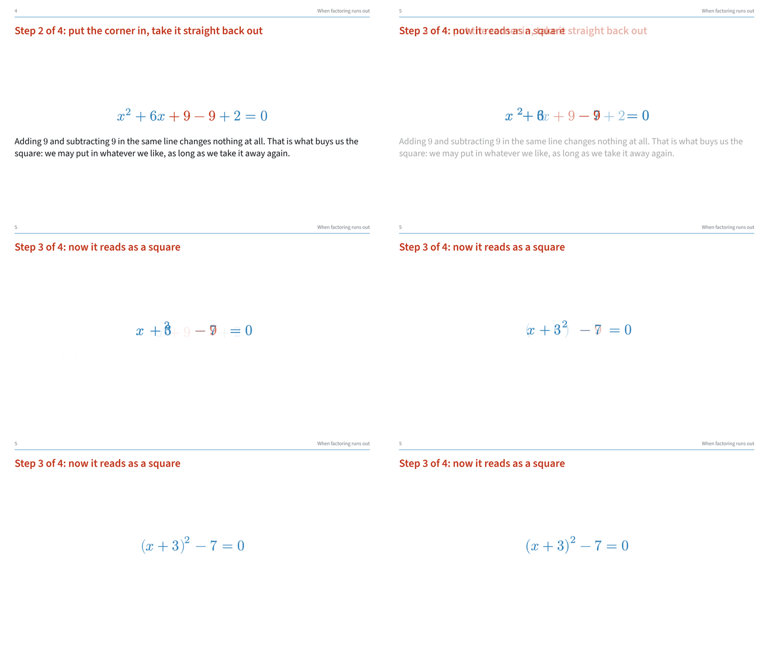
The one worth explaining is morph. Give the same name to something on two adjacent slides and it flies from the one place to the other, matching glyph to glyph. In the deck above the room sees 9 - 9 fold into the square and the 2 walk out to become the -7. It is the same term rewritten, and the motion says so better than a new line ever could.
You can just click through it

Six decks, and I deliberately wrote them as talks somebody might actually give rather than as feature demos:
  • A Tour of typstage, every function once and what it is for
  • How GPS Knows Where You Are, four satellites and a clock nobody trusts
  • The Shape of a Page, why the four margins of a book are unequal
  • Completing the Square, a school lesson
  • Deploying to a Fleet at 3 a.m., error budgets and a live status board
  • Two treatments, one reversal, Simpson’s paradox

Arrow keys step through, o gives an overview, f full screen, s the speaker notes. Every file there is a single self-contained HTML. Save one and it still works offline.

You can try out these sample decks here:
https://loewe1000.github.io/typstage/beispiele/

Where it lives

Source and README:

MIT, needs Typst 0.15. It is not on Universe yet, so for now you clone it into your local package directory.

What would help me most

Four things, none of them long. All of them are places where I have no data, only guesses.

1. Open the example decks in your browser and tell me if anything is wrong. I have only ever tested Chrome. The runtime leans on the Web Animations API, CSS zoom and inline SVG, and I do not know what Firefox or Safari make of it. If something fails to move, sits at the wrong size, or the overview (o) looks broken, that is worth more to me than any opinion on the design. Please say which browser and version.

2. Put a morph on two adjacent slides in your own writing. morph pairs glyphs by their shape, and I have only ever fed it Latin letters and maths. I have no idea what it does with Greek, Cyrillic, CJK or an Arabic line, and I would rather be told than guess. A screenshot of a glyph landing somewhere it has no business being is exactly the report I want.

3. Build something big. One SVG per slide is the whole design, and it has a cost I cannot judge from my own decks. The largest of them is 23 slides and comes to 1.9 MB with 5581 glyph references. If you have a deck of a hundred slides, I would like three numbers: the size of the HTML file, how long the browser takes to show the first slide, and whether stepping still feels immediate at slide 80.

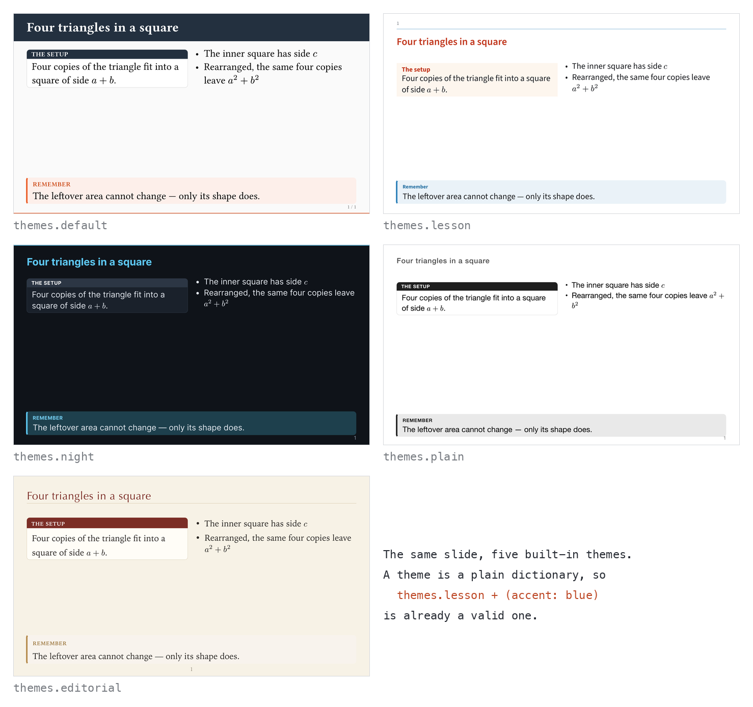
4. Tell me what the themes look like on your machine. They name fonts that exist on macOS (Iowan Old Style, Optima, Helvetica Neue) and fall back to whatever is there otherwise. I have never seen the five themes on a Linux box.

What I am not really after is whether you like the look. What I cannot find out alone is where it breaks: a browser I do not have, a script I do not write, a deck longer than any I would give.

10 Likes

This feels a lot like Slidev + Markdown, but for Typst, which I think is a really good approach. I checked the repo and really like the idea of letting Typst handle the layout while the browser handles the presentation layer.

A few improvements I could imagine are a richer presenter view with synced notes/timer, drawing or laser-pointer support, and stronger built-in layouts or code-presentation features. I think those would bring it quite close to the Slidev experience while keeping the Typst-native workflow.

Are you open to contributions? I’d be interested in discussing some of these ideas and contributing if they fit your direction.

This is really cool and impressive!

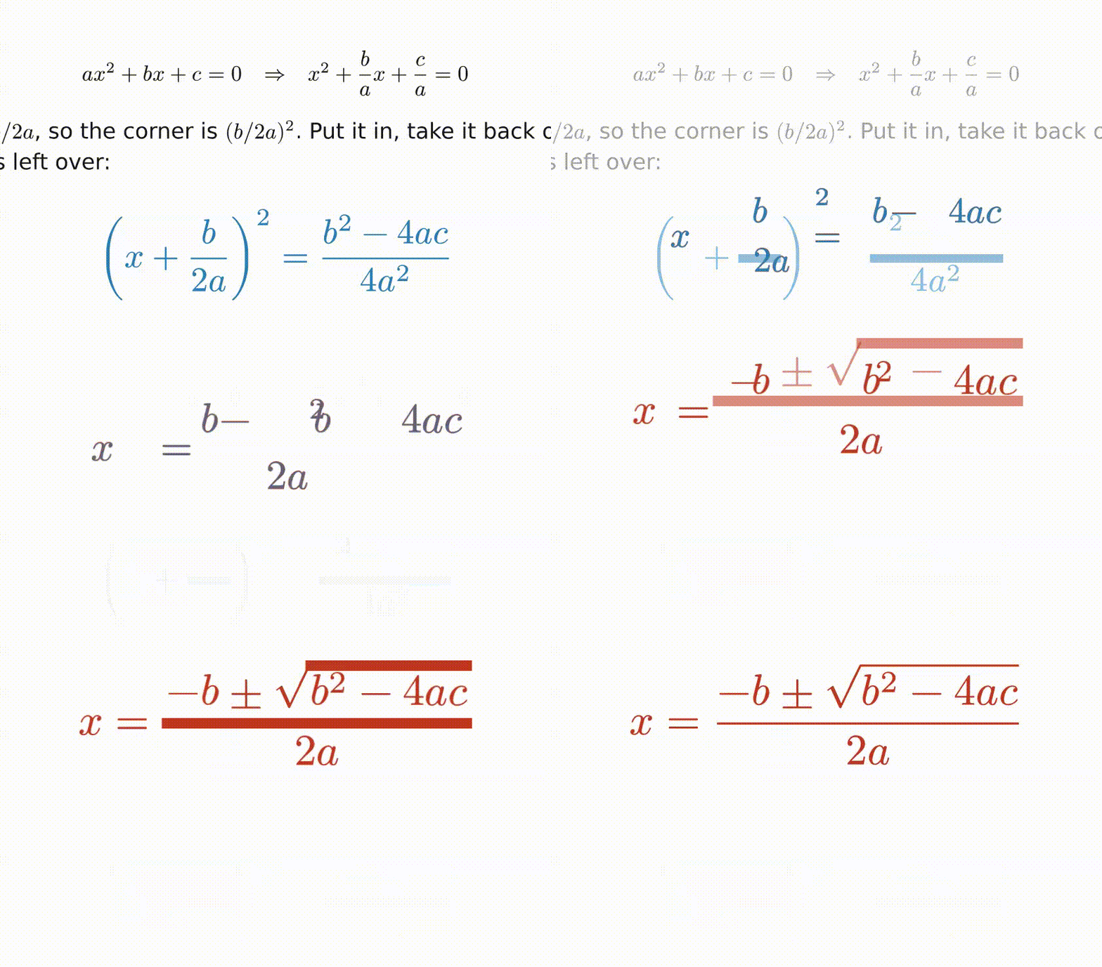
I found that equation morphing is a bit broken on Firefox (Windows), it usually looks like this during morphing:

I think all letters are stretched horizontally.


In the recent time, a lot of slide packages have cropped up. You already explained your principle but I think for users to choose a package, it would also help to make explicit comparisons to a number of other slide packages, especially of the same species (HTML-powered slides) but also in general.

Slydekit author here! I find your work impressive. Manim-like animations are really cool.

After a quick look on the demos, I can see application for my teaching slides.

I hope you will be able to release a comprehensive documentation soon, to help the adoption of your package.

Many code comments in the repo are still in German. I can understand them, even if I am no more a fluent speaker.m, but having them in English would help.

Congrats

That list turned out to be a good work order. Most of it is in now, and it lives in the same single file: press n and the deck opens itself a second time with #speaker on the address, in a second window. Put that one on your laptop and the first one on the projector.

It shows the running slide large, the note below it, a clock, an elapsed timer, and, if you type in a target duration, whether you are ahead of or behind plan. Beside the slide is a preview of the next step rather than the next slide.

On contributing: I am going to say no to shared maintenance for now, and thank you for offering. The internals are still moving under my feet, and I would be a poor collaborator while that is true.

Themes and slide layouts are a different matter, and that is where I would most like the help. A theme is a plain dictionary, so themes.lesson + (accent: blue) is already a valid theme and theme(...) builds one from scratch. If you build one, send a pull request. And if you have a layout in mind that the package cannot do yet, send me an example file of what it should look like, even a rough one, and I will try to rebuild it. That is the most useful thing anyone could hand me right now, because it tells me where the building blocks are too narrow.

Thank you, that report was worth more than the rest of the thread put together. It was a real bug, it is fixed, and it was mine and not your Windows.

The ghost of a flying glyph took its size from that glyph’s box, and the box came from getBoundingClientRect() on the <use> element. On a <use>, Firefox does not return the box of the glyph. It returns the box of the whole SVG

Fair, and the honest version helps me more than a favourable one. I will add a comparison in the Readme.

1 Like

Thank you!

You are right about the comments, and worse than you saw. I counted rather than guessed: the examples are fully English since this week, src is about 60 % German, the runtime about 90 %, and the doc comments are 165 German against 194 English, which is the worst of the three states. Those go first, then an English manual. The manual does exist, as a site and a PDF, it is simply German throughout, and that is the real gap rather than the absence of docs.

Since you mention teaching slides: if you teach maths or physics, the piece you probably want is the companion package typstage-geogebra. It puts a live GeoGebra applet on a slide and drives it from the steps, so ggb-set, ggb-animate and friends reach the applet when their step arrives. The construction stays GeoGebra’s, the dramaturgy comes from the slide.

2 Likes

That makes sense, especially while the internals are still changing. The new presenter view sounds like a very useful addition, and showing the next step rather than just the next slide is a nice detail.

One architectural idea that may be worth keeping in mind later, once things settle down, is using a small Rust/WASM core for any genuinely computation-heavy parts of the runtime. I experimented a little with this on my fork. WASM itself integrates quite cleanly with the single-file HTML model, including file://, but I also found that moving small pieces of the morph logic does not automatically give a noticeable improvement because much of the cost is still DOM/SVG geometry and animation setup.

So I would not suggest moving the runtime to Rust. But if profiling eventually reveals isolated pure-computation hotspots, things like glyph/path analysis, geometry matching, or more advanced correspondence algorithms could be good candidates for a batched WASM module while JavaScript continues to handle the browser side.

In the meantime I will have a look at themes and layouts instead. That sounds like a much better place to contribute while the core is still moving.

Great, it works now. That was a fast fix!

1 Like

Really, cool. I recently looked at Mosaic and I liked it very much, but now I will have a hard time choosing a winner! :sweat_smile:

I’ve tested the sample decks using Firefox on linux and I think they seem OK to me. I don’t know how the fonts should look but they does not seem weird to me. The only glitch I observe is in a math animation, where horizontal lines become thick during a fraction of a second, both in he starting equation and in the target, as shown below:
typstage

Using Chrome (in the same OS) the animation looks OK.

I will certainly study how the sample decks are made and do some experiments. Thank you very much for this package!

1 Like

Really incredible. Hoped to see something like this for a while now, and it looks both aesthetically pleasing and ergonomic to edit!

1 Like

Thank’s for pointing this out. :grin:

Should be fixed now. :white_check_mark:
Would you mind testing it again in your Firefox instance?

I confirm it is OK now. Thank you!

1 Like

I ran your 6 decks through iCab on Mac (built on the Safari WebKit, I believe).

I’m long retired and don’t need to do presentations any more, but this made me wish it had existed when I was a lecturer. Very clean; worked perfectly with nary a glitch. Well done!

:slight_smile:
Mark

1 Like