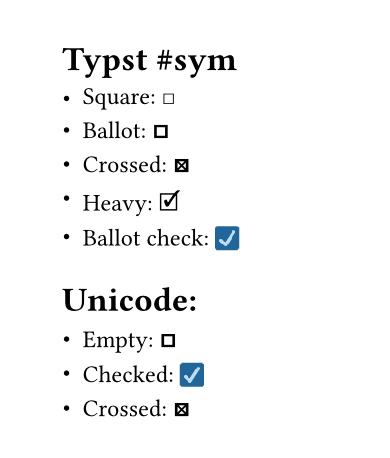
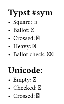
Hey. When rendering the symbols for checkboxes/ballots they look weird, and do not correspond to those in the reference. Is this a bug or how to best resolve?
The symbols depend on the font, so you have full control over the final outcome here, but only if we try carefully. I suggest first turning off font fallback then it will only use the current font, and not try to find the symbol in other fonts.
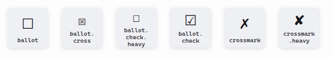
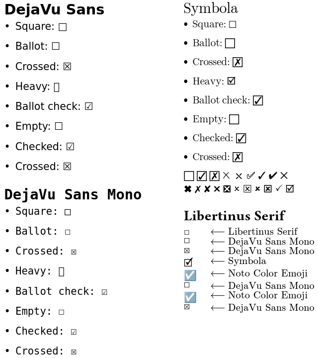
So now we have a new starting point for the question - it’s plain that the default font doesn’t give us any of these symbols, except the first one! Configure a font (or multiple fonts) that has symbols that look nice to you, and then it should be consistent.
I don’t think it’s a bug - symbol appearance always depends on the font used.