My reasoning was rooted into the following:
$> typst fonts --variants --ignore-system-fonts | grep -A 10 'New Computer Modern'
New Computer Modern
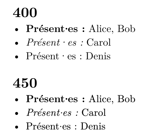
- Style: Normal, Weight: 400, Stretch: FontStretch(1000)
- Style: Normal, Weight: 700, Stretch: FontStretch(1000)
- Style: Italic, Weight: 400, Stretch: FontStretch(1000)
- Style: Italic, Weight: 700, Stretch: FontStretch(1000)
New Computer Modern Math
- Style: Normal, Weight: 700, Stretch: FontStretch(1000)
- Style: Normal, Weight: 450, Stretch: FontStretch(1000)
- Style: Normal, Weight: 400, Stretch: FontStretch(1000)
$> typst fonts --variants | grep -A 10 'New Computer Modern'
New Computer Modern
- Style: Normal, Weight: 450, Stretch: FontStretch(1000)
- Style: Normal, Weight: 400, Stretch: FontStretch(1000)
- Style: Italic, Weight: 450, Stretch: FontStretch(1000)
- Style: Italic, Weight: 700, Stretch: FontStretch(1000)
- Style: Normal, Weight: 700, Stretch: FontStretch(1000)
- Style: Italic, Weight: 400, Stretch: FontStretch(1000)
- Style: Normal, Weight: 400, Stretch: FontStretch(1000)
- Style: Normal, Weight: 700, Stretch: FontStretch(1000)
- Style: Italic, Weight: 400, Stretch: FontStretch(1000)
- Style: Italic, Weight: 700, Stretch: FontStretch(1000)
ie: there aren’t 450-weight NCM fonts provided by the embedded fonts (with the typst-0.13.1 binary)
looking at the TTF infos (ttf2tfm from TeX-live), I get:
Glyph  Code   Glyph Name    Width    llx   lly      urx   ury
--------------------------------------------------------------
$> ttf2tfm NewCM10-Regular.otf oo.tfm | grep middot
  119  000b7  middot          778    336,    0 --   442,  395
$> ttf2tfm NewCM10-Italic.otf oo.tfm | grep middot
  119  000b7  middot          767    414,    0 --   523,  395
$> ttf2tfm NewCM10-Bold.otf oo.tfm | grep middot
  119  000b7  middot          278     61,    0 --   217,  396
$> ttf2tfm NewCM10-Book.otf oo.tfm | grep middot
  119  000b7  middot          278     86,    0 --   192,  345
$> ttf2tfm ewCM10-BookItalic.otf oo.tfm | grep middot
  119  000b7  middot          278    167,    0 --   276,  346
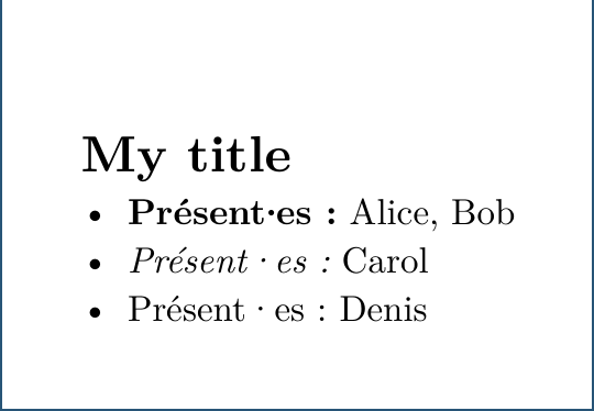
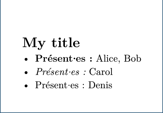
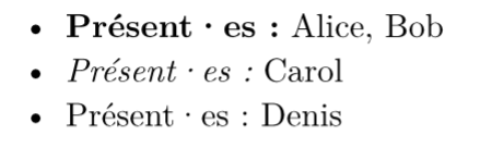
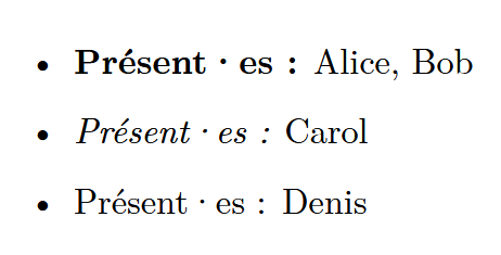
so, the Regular and Italic fonts show a (way) larger width for the middot glyph, compared to the Bold and Book fonts.
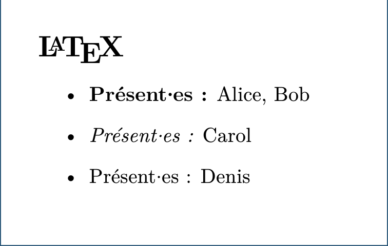
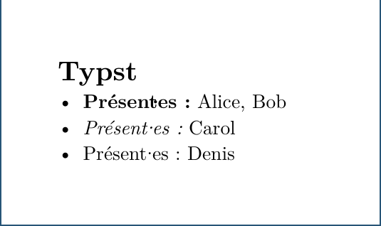
and going back to the LaTeX document, when I comment out \usepackage{newcomputermodern} and use:
\usepackage[olddefault]{fontsetup}, I get the extra glyph width (like you had in your LaTeX output)\usepackage[default]{fontsetup}, I get the smaller glyph width (like I had with \usepackage{newcomputermodern}.
In the documentation of newcomputermodern, they do document the olddefault is Regular and the (new) default is Book.
⇒ it all makes sense. the extra space around the middle-dot is coming from the glyph width definition, which varies from font to font, LaTeX’s default being Book for NewComputerModern.
Case closed, thanks for sticking along  .
.