This has been bugging me since the very beginning, but I still don’t know the answer. And can this be changed/added.
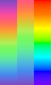
Here’s what it might look like starting from red:
![]()
No clue, I’d guess it just looked nice to whoever made the color map. I can’t seem to find which color map this came from, but pretty much every other one I recognize as in the current color map literature. i.e., Typst team didn’t come up with them.
1 Like
My one and only representation of rainbow is what I’ve learned from very early years and how a rainbow actually looks like, AFAIK.
#set page(width: auto, height: auto, margin: 0pt)
#let stripe(..color-map) = block(
  width: 1cm,
  height: 5cm,
  fill: gradient.linear(angle: 90deg, ..color-map),
)
#grid(
  columns: 3,
  stripe(..color.map.rainbow),
  stripe(..color.map.rainbow.slice(55)),
  stripe(
    rgb("#f00"),
    rgb("#ff7900"),
    rgb("#ff0"),
    rgb("#0f0"),
    rgb("#0ff"),
    rgb("#00f"),
    rgb("#7900ff"),
  ),
)
I also can’t answer authoritatively, but I’d assume that the reason relates to magenta (#f0f) not actually being a color of the rainbow, just the color used to join the rainbow into a circle (Magenta—In optics and color science). The extreme color at the blue end of the spectrum is violet, which Wikipedia gives as #8000ff.
So imo there are two sensible choices: make an optical rainbow from red to violet, or a visual rainbow from magenta to magenta. In the latter, red, wouldn’t be the starting color—but why the “canonical” rainbow (which seems to include magenta) apparently splits up the wheel at violet is a mystery to me.
1 Like
I answer the actual question at the end. tldr, nothing is real and choices are arbitrary, but some matter for different reasons.
how a rainbow actually looks like
Nitpick: to depict the most commonly coded rainbow in programming/art software-land, it should loop back around to red at the end.
But I do think the popular “programmer’s rainbow” (aka the Hue in Hue/Saturation/Value aka the slider in common HSL color pickers aka the circumference of common HSV (circle) color pickers[1]) looks similar but definitely differs from a real rainbow’s colors, which unless I’m misinterpreting, is the in the graphic at Visible spectrum - Wikipedia (oh shoot, realized SillyFreak’s link also has this image).
So imo there are two sensible choices: make an optical rainbow from red to violet, or a visual rainbow from magenta to magenta.
Anyways, it makes sense to me that it just happened so that we ended up starting out with red in the classic “programmer’s rainbow” because RGB is conceptually a three-tuple of floats[2] and red is what you get when you set the zeroth thing to one, and us programmers love starting out with the zeroth things. I don’t think magenta to magenta makes more sense to a programmer’s brain, even if it may or may not from a color science standpoint.
Ok another side tangent, I took a harder look at the perceptual color space OKHSV from [1:1], and they do actually start at magenta lmao. So that’s pretty cool that @ensko thought of that.
Wait a minute… I took another look at Typst’s rainbow color map, and is it just a shifted version of the OKHSV map? Might ping a dev on this. Doesn’t seem documented.
But to answer the original question, since the rainbow color map is a cyclic map, it doesn’t really matter where it starts. Red is historically correct (e.g. HSV) and is informed by the definition of RGB, magenta may make more sense (e.g. OKHSV), and maybe the Typst devs just thought purple looked pretty, or was otherwise a reasonable place to
Disclosure: I’m making up the “programmers start with zero index → RGB zero index is red → rainbow starts with red” thing. It’s speculation.
Yeah yeah, they’re often and historically
u8s, whatever. ↩︎
Well, the last one should be purple, so I fixed it.
Actually, if you remove the purple and pink from the beginning, it kinda looks similar, but very washed and pastel-like/desaturated.
I explicitly then stated that it’s for actual (optical?) rainbow, so this does not apply.
Why is it cyclic? It’s literally the only one. All others aren’t. And this also shouldn’t, since it supposed to start at red and end with purple. So having a more accurate rainbow will actually make it fit in with all other color maps.
If it’s cyclic to literally be the only one that is useful for pretty conic gradients, while all others are useless for that, then that’s a very weak argument.
I can only guess, but I assume the desaturation is to account for the fact that interpolating RGB colors doesn’t approximate the wavelengths of light present in the rainbow very well. E.g. we don’t need to interpolate between ff0 and 0f0, but between ~580nm and ~530nm wavelength, and approximate the eye’s color perception by mixing the appropriate amount of RGB components.
I know it’s not really related to your question, but nitpick: the extreme color is violet; purple is the name for the group of colors that you get by (additively) mixing blue and red. In other words: an optical rainbow contains no shades of purple.
Why is it cyclic? It’s literally the only one. All others aren’t. … So having a more accurate rainbow will actually make it fit in with all other color maps.
It is very late so short response for now: Choosing Colormaps in Matplotlib — Matplotlib 3.10.8 documentation
We only have one cyclic color map right now, yes. But I’d say they have their uses, so at least one should be included, if not more, lest we want users to need to code them manually. I’m not sure if removing it will make the set of maps “fit in” because its already has plenty of diverging and sequential maps. We shouldn’t want to remove all diverting ones too.
I dont like how Im using we here, its not like ive contributed code, but oh well
Yes, but they are closely related and can be used interchangeably to some extent. Moreover, you get фиолетовый no matter which term you use (which de facto translates to purple). And ever since I’ve started learning English, violet was never a thing. So purple it is. But sure.
Yeah, I guess it’s probably not that straightforward of a mapping, but it’s the dead simple approach that I think is very popular (use the edge case colors).
I mean, I don’t really care about removal, but I really don’t know why it’s the only one and is an “artificial” (and desaturated) rainbow. So at the very least, I wanna know the reasoning behind adding specifically such kind of “rainbow”. But also having a built-in or quick-to-DIY rainbow that (probably) everyone learn about since childhood would be a nice closure for me.
Interesting thread and it gave reason to read more about the rainbow spectrum. I’ve never thought about that some colors are outside the spectrum of visible light wavelengths.
It seems clear that color.cmap.rainbow is not worthy of the name because it does not resemble a rainbow at all. The detail I would allow is the desaturation, because natural rainbows are desaturated and blurry when they “appear in the sky”.
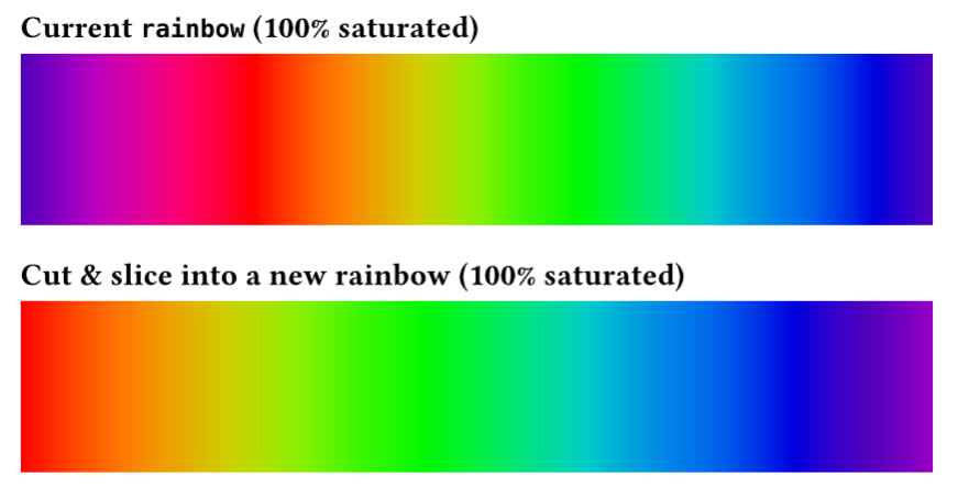
We could take the current rainbow colormap and reorder its colors a bit to create a better rainbow like this, maybe?
#let sat = arr => arr.map(x => x.saturate(100%))
= Current `rainbow` (100% saturated)
#block(width: 100%, height: 3cm,
  fill: gradient.linear(..sat(color.map.rainbow)))
= Cut & slice into a new rainbow (100% saturated)
#block(width: 100%, height: 3cm,
  fill: gradient.linear(..sat(color.map.rainbow.slice(65) + color.map.rainbow.slice(0, 15))))
1 Like
I think cmap is a Matplotlib thing.
Well for me and in the context of a “sky rainbow”, yeah.
Hm, I did not think of being able to (re)saturate it, but I guess I didn’t have a reason. I’m surprised that it actually looks pretty damn good like that. And the already tried shift does indeed help a lot too, though you kinda get the (bright) magenta instead of (dark) purple with this implementation. But other than that it’s pretty close.
#set page(width: auto, height: auto, margin: 0pt)
#let stripe(..color-map) = block(
  width: 1cm,
  height: 5cm,
  fill: gradient.linear(angle: 90deg, ..color-map),
)
#let saturated = color.map.rainbow.map(x => x.saturate(100%))
#grid(
  columns: 4,
  stripe(..color.map.rainbow),
  stripe(..color.map.rainbow.slice(55)),
  stripe(..saturated.slice(55) + saturated.slice(0, 10)),
  stripe(
    rgb("#f00"),
    rgb("#ff7900"),
    rgb("#ff0"),
    rgb("#0f0"),
    rgb("#0ff"),
    rgb("#00f"),
    rgb("#7900ff"),
  ),
)
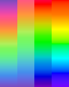
The purple is still a bit off on length/hue and green is much wider, which makes sense in the fact that we see more of green shades?
But I think it’s preferable to have all length more or less the equal.
I guess I can open an issue, but I have no idea what about exactly.
I think a good starting point is the visible color spectrum, not trying to reverse engineer the rainbow from mnemonics. The colors are not discrete, so hard to say which bands are wider. Then you want to compress the gradient more on the reddish side due to how the geometry of the reflections work in the rainbow, I think? But I don’t know how exactly that’s worked out, we can just use this quote from Wikipedia to say that something like that would be appropriate for a rainbow:
White light separates into different colours on entering the raindrop due to dispersion, causing red light to be refracted less than blue light.

(Picture: by Gringer/Wikimedia/PD)
But also having a built-in or quick-to-DIY rainbow that (probably) everyone learn about since childhood would be a nice closure for me.
I agree, this would be nice.
So at the very least, I wanna know the reasoning behind adding specifically such kind of “rainbow”.
I think one of Typst’s design goals is to have things look nice by default. The rainbow color map looks like this (“desaturated”) because it’s designed as a more perceptually uniform map. I noted above that it looked strikingly similar to OKHSV.
See https://bottosson.github.io/posts/oklab/#comparing-oklab-to-hsv for an example of perceptual vs naive color map. Note that oklab is the example for perceptual, not okhsv. The entire blog post and the guy’s entire blog is some pretty fun reading if you’re into this sort of thing. The link in the footnote below is also nice for examples and reading.
Whether it is good for it to be named rainbow is also a valid question. Non-“programmer’s rainbow” maps sometimes are named rainbow in other programs as well, I believe. Can’t be bothered to look. But some non-“programmer’s rainbow” maps have specific names. Jet is one that is pretty prominent in the color map literature for being not perceptually uniform ![]() Turbo is another named rainbow map that’s more uniform.[1] I believe neither are cyclic.
Turbo is another named rainbow map that’s more uniform.[1] I believe neither are cyclic.
Now that I’m looking at it, I’m curious—what are yall’s thoughts on Turbo?
1 Like