0 to 100% -> purple (cold) to red (hot) conversion?

Heatmap table / conditionnal formatting showcased how it’s even possible to generate a ‘heatmap’ in Typst. This is very impressive, although I’m looking for something a lot simpler.

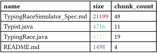
This is the data I would like to colour-code:

#show table.cell.where(y: 0): strong
#table(columns: 3, table.header("name","size","chunk_count"),"TypingRaceSimulator_Spec.md","21199","48","Typist.java", "4716","11","TypingRace.java","8177","19","README.md","1498","4")

For size, I need to:

  1. find min and max values between values in that column (in this case respectively 1498 and 21199)
  2. Normalise the range to 0 (1498) and 100 (21199) %
  3. Generate a colour hue from a ‘rainbow’ spectrum from purple/cold (0%) to red/hot (100%)

For chunk_count, I need to do the same thing, only I’m comparing the proportions between each other (21199:48,4716:11,8177:19,1498:4), not the values themselves (48,11,19,4).

Do you have any suggestions as to how this could be achievable in Typst?

Hi, do you mean like this?

#let my-gradient = gradient.linear(..color.map.spectral.rev())

#let values = (
  "TypingRaceSimulator_Spec.md", "21199", "48",
  "Typist.java",                 "4716",  "11",
  "TypingRace.java",             "8177",  "19",
  "README.md",                   "1498",  "4"
)

#let sizes = values.chunks(3).map(chunk => int(chunk.at(1)))
#let min = calc.min(..sizes)
#let max = calc.max(..sizes)
#let sizes-percent = sizes.map(s => (s - min) / (max - min) * 100%)

#show table.cell.where(y: 0): strong
#show table.cell.where(x: 1): it => {
  if it.y == 0 { return it }
  let i = it.y - 1
  set text(fill: my-gradient.sample(sizes-percent.at(i)))
  it
}

#table(
  columns: 3,
  table.header("name", "size", "chunk_count"),
  ..values,
)

3 Likes

you could write a function that takes in some information about how the table should be colored and does some computation to determine the color. I don’t know your exact use cases so i’ll let you customise the API yourself, but this should at least get you started:

#let normalize(value, min, max) = {
  let n = (value - min) / (max - min) * 100
  n = calc.clamp(n, 0, 100)
  return n * 1%
}

#let gradienttable(gradientspecs: (), ..args) = {
  let numcols = args.at("columns")
  let (header, ..entries) = args.pos()
  
  let cols = array.zip(..entries.chunks(numcols))
  let colorcols = cols 
  
  for spec in gradientspecs {
    let col = cols.at(spec.index)
    let data = col.map(float)
    if "comparison-index" in spec {
      let comparison-data = cols.at(spec.comparison-index).map(float)
      data = array.zip(data, comparison-data).map(((a, b)) => b / a)
    }
    
    let min = calc.min(..data)
    let max = calc.max(..data)
    colorcols.at(spec.index) = array.zip(col, data).map(((content, data)) => {
      let amt = normalize(data, min, max)
      let color = color.mix(
        (spec.cold, 100% - amt),
        (spec.hot, amt),
      )
      table.cell(fill: color, content)
    })
  }
  
  entries = array.zip(..colorcols).flatten()
  return table(..args.named(), header, ..entries)
}

you can call it like so:

#gradienttable(
  gradientspecs: (
    (
      "index": 1,
      "cold": purple,
      "hot": red
    ),
    (
      "index": 2,
      "comparison-index": 1,
      "cold": purple,
      "hot": red
    ),
  ),
  columns: 3,
  table.header("name","size","chunk_count"),
  "TypingRaceSimulator_Spec.md","21199","48",
  "Typist.java", "4716", "11",
  "TypingRace.java", "8177", "19", 
  "README.md", "1498", "4"
)

I don’t know what a rainbow spectrum from purple/red is, but customising the color information should not be difficult.

3 Likes

(post deleted by author)

Thank you very much everyone, these are some great examples to work from!

Not sure why 4716 and 1498 appear the same (maybe I should adjust the spectrum?) but looking nice!

they’re not exactly the same if you look closely. A slightly more elaborate answer us that the way I calculate the color is kind of bad for data visualisation, meaning that it is not perceptually uniform so 0% and 16% appear similar. I don’t know anything about color theory, so did not bother with a more elaborate solution. Typst natively supports a perceptually uniform color map called turbo, see: Color Type – Typst Documentation

If your data contains some very high and very low values, you may also want to consider some sort of normalisation of the data.

1 Like

I might look into using turbo, which seems to be a good all-round choice (and a good approximation of the whole purple/red cold/hot idea).

Because the colour map range is an octet (0-255) I believe I will have to normalise to that range of values rather than from 0 to 100.