Hello! $arrow.hook$ has bigger tail than LaTeX. How can I make it smaller?
Typst:
![]()
LaTeX:

Hello! $arrow.hook$ has bigger tail than LaTeX. How can I make it smaller?
Typst:
![]()
LaTeX:
What symbol in LaTeX? \hookrightarrow? How does it look if you literally paste “![]() ” into the Typst code?
” into the Typst code?
Hello!
I think it is https://tex.stackexchange.com/questions/66275/how-to-typeset-inclusion-arrow \xhookrightarrow, which is commonly used to typeset injections.
Could this be because you are comparing two different fonts?
See How does one avoid caligraphic font difference between Typst and LaTeX?
Hello! Thanks for helping.
According to ChatGPT, \xhookrightarrow is not a unicode character, but rather drawn from multiple parts: ChatGPT - \xhookrightarrow in LaTeX
As I have experienced myself, if I really zoom in, there might be a slit between the hook and the straight part of the arrow, so that seems plausible.
Is Typst’s bounding box system mature enough to support such drawn characters?
That’s a stretchable glyph. You can use stretch for that in Typst:
$ a stretch(arrow.hook)^"xxxxxx" b $
![]()
or just stretch(arrow.hook, size: #200%) to specify a size without an attachment.
Hello! Thanks for helping.
That would be helpful, however that’s not the only distinction. arrow.hook have its hook’s highest point at the same height (if not higher) than its tip, making it look unbalanced.
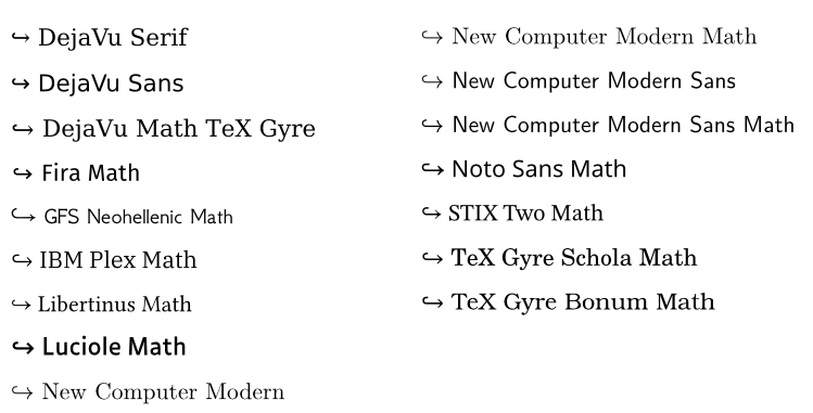
It depends on the font’s design. Each font defines its own glyph for a character or symbol. A few examples from some fonts available on typst.app:
They all give me the impression of ‘Reply’ or ‘U-turn’, but not ‘injection’. Maybe I’m too used to \xhookrightarrow.