Bryn
August 5, 2025, 12:58am
1
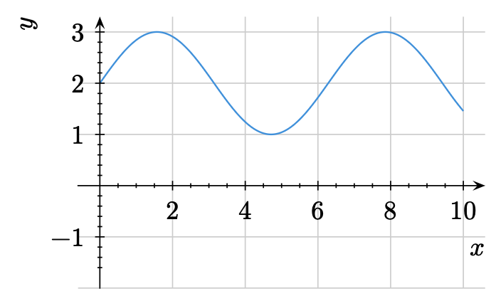
I am trying to create plots for school students in lilaq, and have used the schoolbox-style from the documentation and set the alignment for the axes to be “top”/“right”.
#show: schoolbook-style
#show lq.selector(lq.label): set align(top + right)

#let xvals = lq.linspace(0, 10)
#lq.diagram(
  ylim: (-2, auto),
  xlabel: [$x$],
  ylabel: [$y$],
  lq.plot(xvals, xvals.map(x => calc.sin(x) + 2),
  mark: none,
  smooth: true)
)
The default behaviour with my current code is to have the axes labels in the following locations, which is not where I want them.
I can move the axes labels to where I want them, but this method does not seem particularly robust (and is probably dependent on the font choices and other factors).
xlabel: lq.xlabel(dx: 0.8em, dy: -2.4em)[$x$],
ylabel: lq.ylabel(angle: 0deg, dx: 2.8em, dy: -1.2em)[$y$],
Is there a way I can have these axes labels where I want them without resorting to using dx and dy in this fashion?
1 Like
Hi @Bryn ,
This is a very good question, and although I too would like to center axes labels on lilaq diagrams, a discussion started on that here: How to rotate or reposition axis labels in lilaq? - #3 by janekfleper
I suggest the discussion carries on there as this is a duplicate.
1 Like
Bryn
August 5, 2025, 8:08pm
3
Thanks for the reference - I had not seen that question, and although it is slightly different, the discussion indicates that currently it’s not possible to achieve the flexibility I would like.
Mc-Zen
September 19, 2025, 8:21pm
4
Hi @Bryn ,
this should now be easier due to a fix for label.pad: none. The built-in schoolbook theme has also been improved to account for this problem!
Bryn
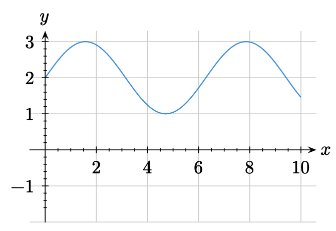
September 20, 2025, 7:10am
5
Thanks for releasing this new version!
Unfortunately, even with the clues provided above, I cannot get the axis labels where I wanted. How can I use lilaq v0.5.0 to graph y = sin(x) + 2 with the axes labels in at the end of the arrows as in my original diagram?
This is the code I have tried based on the notes above:
#import "@preview/lilaq:0.5.0" as lq

#show: lq.theme.schoolbook
#show: lq.set-label(angle: 0deg, pad: none)

#let xvals = lq.linspace(0, 10)
#lq.diagram(
  ylim: (-2, auto),
  xlabel: $x$,
  ylabel: $y$,
  lq.plot(xvals, xvals.map(x => calc.sin(x) + 2),
  mark: none,
  smooth: true)
)
but the result is
Mc-Zen
September 20, 2025, 8:21am
6
In this case, you just need a small adjustment to the theme:
#let schoolbook = it => {
  let filter(value, distance) = value != 0 and distance >= 5pt
  let axis-args = (position: 0, filter: filter)


  show: lq.set-tick(inset: 1.5pt, outset: 1.5pt, pad: 0.4em)
  show: lq.set-spine(tip: tiptoe.stealth)
  show: lq.set-grid(stroke: none)

  show: lq.set-diagram(xaxis: axis-args, yaxis: axis-args)

  show: lq.set-label(pad: none, angle: 0deg)
  show: lq.show_(
    lq.label.with(kind: "y"),
    it => place(bottom + center, dy: -100% - .5em, it)
  )
  show: lq.show_(
    lq.label.with(kind: "x"),
    it => place(left + horizon, dx: 100% + .5em, it)
  )

  it
}
1 Like
Bryn
September 20, 2025, 12:08pm
7
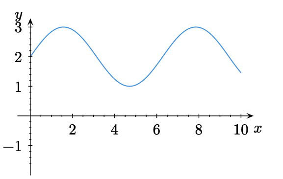
Thanks. For the benefit who is following along, I then took the code above and modified it slightly to fit what I now want to create a graph with the axis labels in the right spot. I also changed the arrow heads to match a style I am now trying to match.
I feel as though I read somewhere that one doesn’t need to use map any more to plot functions, but I can no longer find that.
Code to generate the plot in lilaq 0.5.0
#import "@preview/lilaq:0.5.0" as lq
#import "@preview/tiptoe:0.3.1"

#let schoolbook = it => {
  let filter(value, distance) = value != 0 and distance >= 5pt
  let axis-args = (position: 0, filter: filter, subticks: none)


  show: lq.set-tick(inset: 1.5pt, outset: 1.5pt, pad: 0.4em)
  show: lq.set-spine(tip: tiptoe.triangle)
  show: lq.set-grid(stroke: none)

  show: lq.set-diagram(cycle: (black,), xaxis: axis-args, yaxis: axis-args)

  show: lq.set-label(pad: none, angle: 0deg)

  show: lq.show_(
    lq.label.with(kind: "y"),
    it => place(bottom + center, dy: -100% - .5em, it)
  )
  show: lq.show_(
    lq.label.with(kind: "x"),
    it => place(left + horizon, dx: 100% + .5em, it)
  )

  it
}

#show: schoolbook

#let xvals = lq.linspace(0, 10)
#lq.diagram(
  ylim: (-1.5, auto),
  xlabel: $t$,
  ylabel: $T$,
  grid: 0.5pt + luma(200),
  lq.place(0, 0, align: top+right, pad(0.2em, $O$)),
  lq.plot(xvals, xvals.map(x => calc.sin(x) + 2),
          mark: none,
          smooth: true)
)
1 Like
Andrew
September 20, 2025, 12:23pm
8
1 Like