Text stroke seems to “eat” into the letters. A negative width to reverse the direction is rejected. I need the opposite: when rendering text on an image, I want a thin border, a gradient from white near the black text, fading out into transparent far from the text.
// Evil helper function, using evil h hack and duplicate text
#let opposite-stroke(stroke: black + 1pt, body) = context {
  box(text(stroke: stroke, fill: rgb("#00000000"), body))
  let m = measure(body)
  h(- m.width)
  box(body)
}

// A boring and nonsense example
#opposite-stroke(stroke: blue+1pt)[
  foo
  #set text(fill: green)
  bar\
  #set text(fill: yellow)
  baz
]
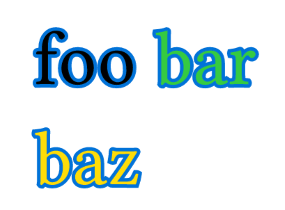
Renders perfectly, but with extremely ugly code. 
Wooo, some blackue magic there, amazing! And looks much better than the default bleed-inward stroke!
As I’m trying to grasp this, I realise that this works because apparently stroke is centered on the text outline. I didn’t even notice, because the inward overlapping part is extremely overwhelming. Your solution should be the default for text stroke!
I ran into this recently too and agree that there should be a built-in way to render text in this way where the stroke only applies “outwards”. That way should maybe even be the default way - it makes more sense to me also.
relevant issues:
and
Liking open issues encourages the team to prioritise them :)